There's only one iPad (discounting model variations) but there's a small army of Android tablets demanding your attention and your money. The question is, are any of them better than the market defining Apple? DaniWeb goes hands-on to find out...
If you think about tablet computing these days then the chances are what you actually mean is the Apple iPad vision of a slate-based device. That's not altogether surprising when you consider how long Microsoft, and others, had been trying to break this market only to falter and fail. The iPad, without doubt, energized a genre by pretty much redefining it. Of course, that energy is boosted by competition and nowhere is this stronger than the small army of Android-powered tablets that are now available for the seasonal shopper. But should you hang fire until the Spring and see what iPad 2 has to offer (most likely an improved screen, a front facing video camera, more grunt under the hood plus a thinner profile) or opt for an Android now? DaniWeb has been playing with some of the contenders for your Christmas cash in an attempt to see if any are truly deserving of the 'iPad beater' title.
Please note that all the tablets tested in this round-up were UK models, hence the UK pricing. Availability and pricing may vary in other markets, although the basic specs and design will likely be identical.
Price
From £260
Likes
Design
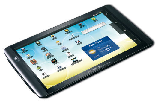
Archos has a track record of producing well built and sturdy devices that are more geared towards functionality than designer looks. The 101 is a bit of a surprising mix to be honest: externally it feels a little plasticky in the hand but a metal chassis makes it pretty durable. At 480g it sits somewhere in the middle ground for tablet weight, and it's not exactly fat at 12mm thick either. The designer looks are absent, this very much looks like an Archos rather than an iPad, but it does make for something slightly different in a market full of iPad wannabes.
Android
Another Android 2.2 device, which is good, especially at this price point. More expensive tablets have opted for Android 1.6 instead, so Archos deserves credit for going the extra Android mile as slate slash touch computing is more enjoyable, if not perfect, with the later OS version.
Display
As the name suggests, you get a full 10.1" screen for your money. In this case a 1,024x600 resolution TFT that is vibrant and crisp on the colour front. Talking of the front, the screen is glass-fronted so expect the inevitable direct sunlight reflection problems which make it very hard to use outside indeed. Indoors though and it comes alive, and the capacitive touchscreen is not only duly sensitive but multitouch supporting and a joy to use.
Kickstand
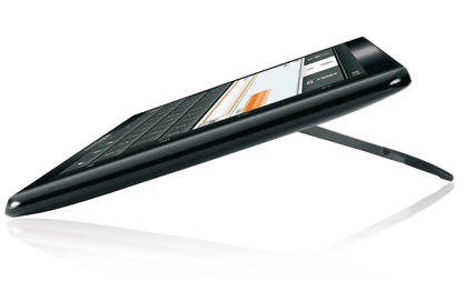
Why don't more tablets come with a built-in kickstand such as the one found on the back of the Archos 101 which lets you stand it up without fuss or fiddling about or buying some costly accessory?
Dislikes
Speed
The Archos is very much a middle ground machine: price, build, display. The same applies to performance which is distinctly average, but perfectly usable nonetheless. It's not as quick to load web pages as an iPad and slower than everything else looked at other than the Next 7" tablet. The 1GHz ARM Cortex A8 processor should do better, maybe it's the 256MB of RAM that's the problem.
Apps
Archos, like some others, has opted to opt out of the Android Market so your choice of apps is limited to those provided at the Archos AppsLib Library instead.
Verdict
Not a bad machine, given the price. It's basically OK, with the emphasise on basic. If you are looking to buy a 10" tablet this Christmas but cannot run to the cost of an iPad, the Archos 101 is probably your best bet.
Rating
7/10
Price
£99
Likes
Cost
What's not to like about a tablet for £99? At this price it could become a candidate for the geek stocking filler gift list. Were it not for the few small problems below, that is.
Dislikes
Speed
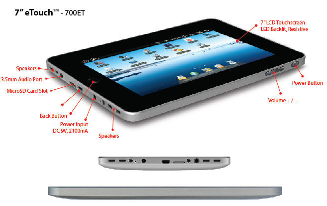
Oh dear, hardly any RAM (128MB) and a slow and underpowered processor (300MHz) do not a great performance experience make. This is, without any doubt and by some considerable margin, the slowest Android tablet put to the test here. Don't expect to load an average web page in under a minute, no, seriously. This was so slow I expected to hear those old-fashioned modem tones while it was connecting.
Screen
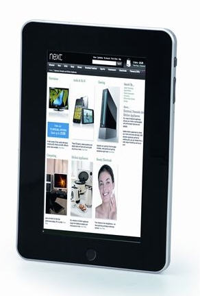
The 800x400 resolution of this unresponsive 7" resistive screen is pretty uninspiring. Sharp is not a word you will associate with it after a few minutes of use, nor is vibrant.
Apps
Apps? What apps? Actually that's not fair as there are apps, but not from the Android Market as you might imagine (which is not supported) instead from some generic App Market link which is rather uninspiring in terms of content.
Android
No Android 2.2 at this price, instead you have to make do with 1.6 which really isn't brilliant on a tablet device.
Build
The Next 7" Tablet is actually an Elonex model in disguise, but I'm not 100% sure what it is disguised as. A well built, cutting edge bit of technology it most certainly isn't. The build quality is what you might expect given the price point, which is creaking plastic everywhere.
Verdict
My late father always used to tell me that you got what you paid for, and the Next 7" Tablet pretty much proves his point. Cheap, in this case, is most certainly not cheerful. Not cheerful at all.
Rating
1/10
Price
From £529
Likes
Display
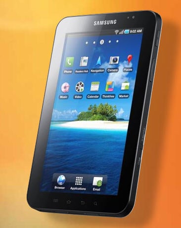
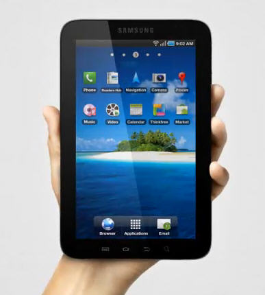
Ah, the screen. When I first booted this thing up I honestly thought that it had an AMOLED screen for a moment or three. But no, it's a TFT albeit a really nice little 7", 1,024x600 resolution one: bright, sharp, vibrant and more than up to the job in hand (oh ha ha ha) as long as you don't want to read anything outside in direct sunshine that is.
Camera
Ah yes, the iPad cannot do the camera thing can it? The Galaxy Tab can, in the shape of a 3 megapixel, LED flash enabled unit which produces decent enough images and can put its hand to 720x480 resolution video for good measure. Not forgetting the 1.3 megapixel front-facing camera for video calling...
Android
Implementing Android 2.2 you would expect the Galaxy Tab to be a thing of interface beauty, and for the most part it is. The true multi-tasking support is cool (iOS 4 users note) as is the ability to selectively kill off apps running in the background. And, of course, there's support for all those groovy designed for Android 2 apps as well as Flash...
Dislikes
Size
This one is, I have to admit, a very personal thing: some folk love the 7" screen and other, myself and Steve Jobs included, thinks it fails by falling between the smartphone at one end of the mobile computing scale and iPad at the full sized tablet other. While it is perfectly usable enough, I am stuck as to wondering exactly what it's for. If I want pocketable portability then there's the iPhone and if I want powerful portability or a coffee table tablet then there's the iPad (or the Android alternatives to both). The Galaxy Tab sadly left me a little bemused, being too big for my pocket and not big enough for truly user friendly slate computing. The only upside of the size is the corresponding weight loss compared to the iPad, at just 385g instead of 680g I know which I would rather hump around for any length of time. What I would say is you really need to try before you buy, and that means literally getting hands-on with a Tab to see if it's too big, too small or just the right size for you.
Cost
The Galaxy Tab has a lot going for it, but pricing is not one of those things. As mobile network operators start providing on-contract discounts this will improve, until you work out how much it's costing you over the life of a two year contract that is. If you want to compete with a style icon such as the iPad, which comes with a certain price premium all of its own as we all know, then selling your cheapest version at £100 more than the cheapest iPad is not the way to do it. If you'll excuse the pun, I know the comparing apples with apples thing will come up here as the cheapest iPad doesn't come with 3G and the Galaxy tab does, but, even so...
Speed
Not the fastest tablet we tested, and not the slowest either. But for a device costing this much you might imagine it would perform as well as the iPad (it didn't) and blow away the likes of the ViewPad (it didn't). Loading web pages was acceptably speedy, but again lagged behind those two devices. The Galaxy Tab actually felt, well, average as far as in the hand performance was concerned. Which is not what you want from a 1GHz ARM-based processor packing and premium-priced product.
Build
If we are comparing the Galaxy Tab to the iPad, and we are folks, then there is a distinct sense of disappointment when you pick one up for the first time. There's nothing wrong with the Tab in terms of build quality per se, but it does feel a tad plastic compared to the iPad despite costing £100 more. Heck, the Tab feels a bit cheap in comparison to the ViewSonic ViewPad on first feel and that costs £100 less.
Verdict
One of the best of the Android bunch, and probably the one most likely to provide the iPad with any real Christmas competition. However, the size issue remains a thorn in the Galaxy tab side as does the cost. If one went up and the other down, Samsung could be on to an iPad beating winner. But it's a big if.
Rating
7/10
Price
£329.99
Likes
Android
Another manufacturer which makes the right choice of OS in Android 2.2 rather opting for the less than tablet friendly 1.6 version. Something, at least, that Toshiba got right with the otherwise rather less than impressive Folio 100. Well, after it produced a patch to add Flash into the mix, that is.
Display
A Nvidia Tegra 250 processor with integrated graphics ensures that what you see is what you'd like to get, be it streaming video via the HDMI port to your HDTV or just looking at photos from the desktop. The colours are bright and sharp, and the, 1,024x600, 10.1” capacitive touch screen responsive in use.
Interface
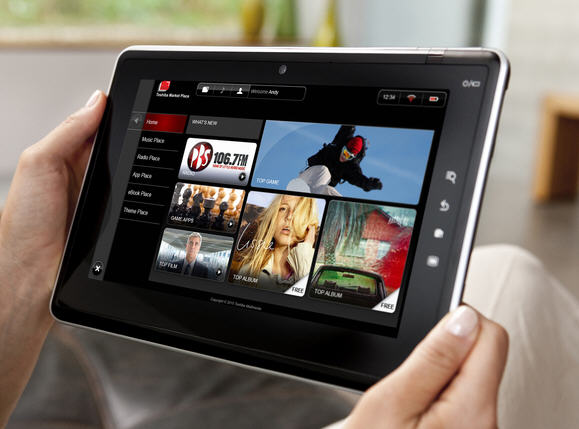
The Toshiba tweaking of the interface is nicely done on the whole, especially in the area of on-screen shortcuts (switch off your Bluetooth connectivity or wireless from the desktop) and network configuration (setting up a remote desktop connection using the aptly named SingleClick Connect for example) as well as the ability to get all your software updates from a central 'Service Station' resource. Well played, Toshiba. What a shame you dropped the ball so many times elsewhere in the game.
Dislikes
Cost
Ordinarily the fact that a tablet device carrying the Toshiba brand and sporting a multi touch screen would end up in the likes column. Unfortunately, the Toshiba Folio 100 does not represent good value for money even at this price point for all the reasons that are about to follow.
Build
What happened to the build quality? I can only assume it got sacrificed at the alter of cost and speed to market. It's not as bad as the Next 7", I admit, but it's not what you would expect of a Toshiba branded device either. It has a distinctly plastic feel, and the one we played with didn't provide any hint of a product that was going to be around for any great deal of time. Just because something isn't expensive it doesn't follow that it has to feel this cheap.
Display
Yes I know that display is also in the likes column, but there's one thing not to like: the appalling viewing angles of the screen which don't allow you much other than a straight on perspective.
Apps
Again, no Android Market support and precious few decent apps in the Toshiba Market Place. I wish that vendors would stop trying to do an Apple App Store on us and chase the money through their own storefront. Not least as none of them are anything like the Apple App Store in terms of actual offerings. Why not give the customer some choice by giving them access to the Android Store?
Design
The Folio is heavy at 780g and both looks and feels more like a keyboardless notebook than a true tablet, truth be told. It has none of the designer attractiveness and cool of the iPad, none of the quirkiness of the Galaxy Tab. What you are left with is a device which looks awkward, and that awkwardness is reflected in usage. The hardware buttons on the unit we played with were just plain unresponsive, requiring many pushes to spring into action.
Verdict
The Folio has had a less than successful tablet launch in the UK, with reports that stores such as PC World have even taken to pricing it at £999 in order to prevent people buying it after a much higher than expected return rate from customers.
Rating
3/10
Price
£429
Likes
Dual boot
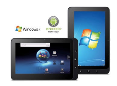
The unique selling point for the ViewSonic ViewPad 10 has to be the fact that it can dual-boot Android and Windows 7. Sure, you can hack your own tablet to achieve this if you don't mind rolling up your virtual sleeves but the thing here is that the dual-booting is a standard configuration, straight out of the box.
Speed
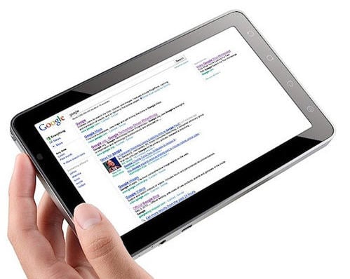
The ViewPad is something of a Speedy Gonzalez when it comes to web browsing which, in my experience, is around twice as quick in terms of page loads than the iPad. In general, it's a pretty quick device provided you have opted to boot into Android, and the dual-core Intel Pine Trail N455 processor even keeps Windows 7 from clogging things up too much.
Ports
In the 'better than iPad' column you can add the fact that the ViewPad comes with no less than two fully functional USB ports that actually work.
Display
The 10", 1024x600, capacitive touchscreen is both colourful and bright, although in fairness it could be a little sharper.
Build
The build quality is as good as you would hope for given the non-budget pricing of the ViewPad: a good mix of metal and plastic means it feels solid in the hand and provides confidence that your investment will not vanish should you drop it on the living room carpet.
Dislikes
Android version
Unfortunately it's not Android 2.2 but 1.6, which while fast and stable enough remains something of a bummer if you wanted Flash support or a any of those new Android 2 apps to actually work.
Design
Whoever designed the ViewPad should be taken outside and metaphorically shot. Why does the 'home' button actually provide 'back' functionality (unless you are using Windows 7 when it does nothing), and why does a back arrow button throw up a menu rather than go backwards? Why do I have to use a menu to enter a URL rather than just tapping the screen? Then there's the noise during use, that fan is so intrusive. the ViewPad is heavier than an iPad and gets a lotter hotter as well. I could go on, but we would be here for some time...
Storage
ViewSonic has been just a little mean when it comes to on-board storage. Allowing for the dual-booting nature of the tablet, the 16GB SSD only gives you around 4GB of free space for your data and other than that you are left with a microSD slot to play with. Not good. The iPad wins the file storage battle hands down.
Windows 7
Sorry, the dual boot function is cool but after the novelty wears off you'll be using nothing but Android. The brute-force power is there to run it, but a desktop OS on a touch-based tablet is a recipe for disaster.
Verdict
An interesting dual-boot concept with some undoubted good points, unfortunately neither OS supplied is ideal for tablet use.
Rating
5/10
