Wednesday 6th June 2012 is World IPv6 Launch Day (no, seriously, it is) and, we have been continually reminded in a Chicken Little fashion, the IPv4 address space sky is falling. The fact that the media obsession with Internet addresses running out has been on-going for at least a decade now, fuelled no doubt by slow news days and headline space to fill, has led to something of a blasé attitude towards making the move over to IPv6. Indeed, you might be forgiven for thinking that the whole IPv6 thing had fallen by the wayside and become another Betamax technology.
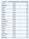
This could hardly be further from the truth, and the rollout of IPv6 adoption continues to pick up pace. But just how many internet services are geared for that adoption, and how many networks are already enabled now where you live? The latter is something that RIPE NCC, one of the five Regional Internet Registries, has quite naturally been taking an interest in. Such an interest that it has developed a rather clever interactive graph that enables anyone to quickly and easily see the level of IPv6 take up in their country. Not only that, but also compare the number of IPv6 enabled networks between any number of countries on the graph by way of drop down menu selection. The graph takes 2004 as the starting point, and allows the user to search by country or region. The data displayed relates to the percentage of Autonomous Systems that have announced one or more IPv6 prefixes in the global routing table and reveals that this has increased across all regions as you might have expected given that it covers an eight year period. However, it also shows that 7 out of the top 10 countries are located in the RIPE NCC service region of Europe, Central Asia and the Middle East while the UK and the US do not make it into the top twenty globally. All the Scandinavian countries, meanwhile, are right up there in the top 10 European countries and the top 12 worldwide for IPv6 adoption.
The top 20 countries, globally showing highest IPv6 penetration, are shown here:


