jeffmylife 76 Newbie Poster

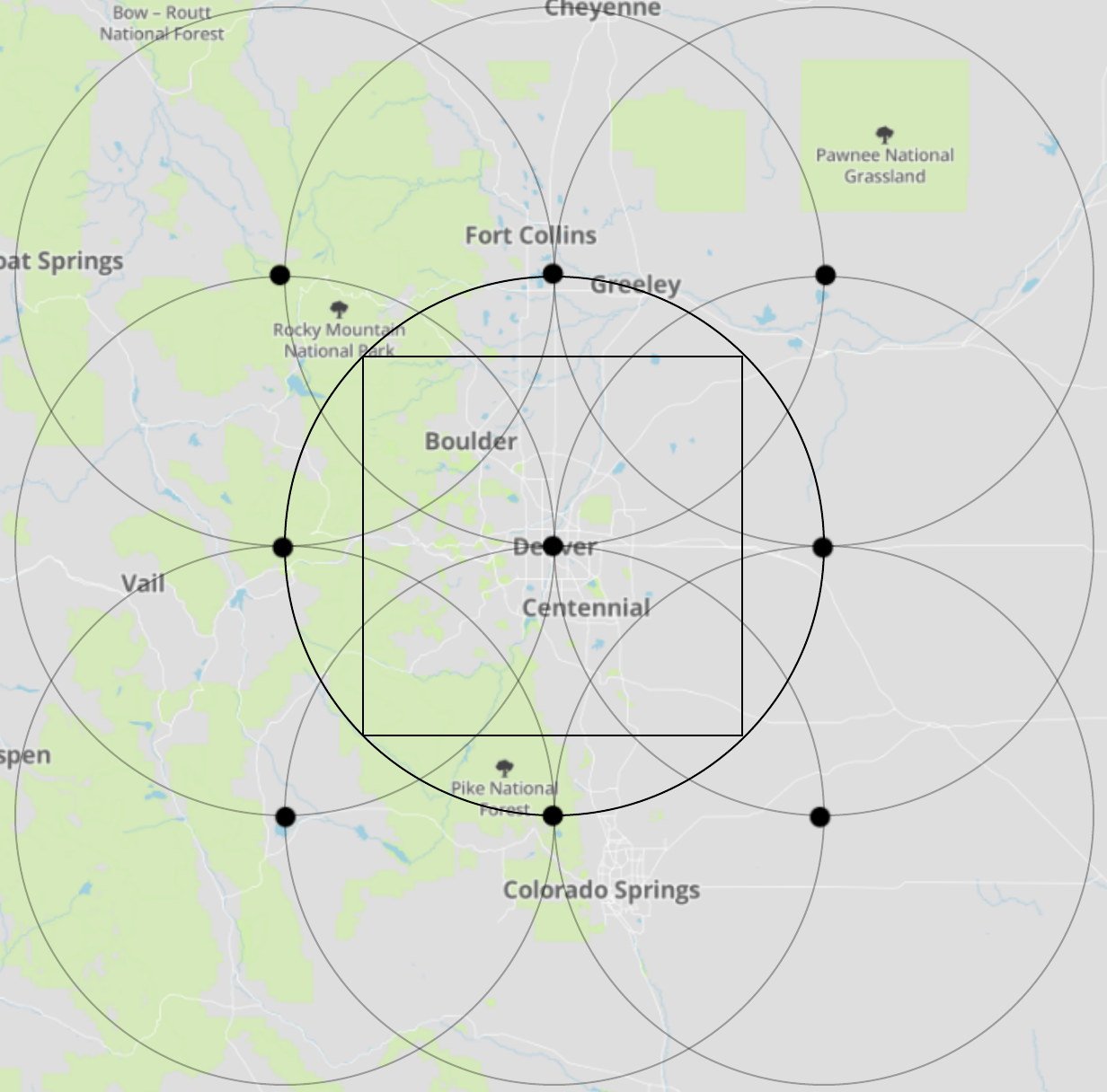
If not interested in theory and just want to see an application, please visit https://github.com/jeffmylife/casual/blob/master/Voromap.ipynb for a notebook on an easy-to-understand practical application of Voronoi diagrams.
Or visit wikipedia's https://en.wikipedia.org/wiki/Voronoi_diagram#Applications list of applications.

jeffmylife 76 Newbie Poster
What Are Voronoi Diagrams?

Voronoi Diagrams are an essential visualization to have in your toolbox. The diagram’s structure is a data-driven tessellation of a plane and may be colored by random or to add additional information.

Learn the Lingo

The set of points that generate the Voronoi diagram are called “seeds” or “generators” for they generate the polygon shapes; in practice, the seeds are your cleaned data. Each seed generates its own polygon called a Voronoi “cell,” and all of 2-dimensional (2D) space is associated with only one cell. A Voronoi cell, or Voronoi “region” denotes all of the space in the plane that is closest to its seed. Cell boundaries shared between two regions signify the space that is equally distant, or “equidistant”, to the seeds.

Formal Definition

Given a distance metric dist and a dataset D of n 2-dimensional generator coordinates, a Voronoi diagram partitions the plane into n distinct regions. For each seed k in D, a region Rk is defined by the Region equation.

region_eq.png

In English, the equation is “This region is equal to the set of points in 2D space such that the distance between any one of these points and this generator is less than the distance between the point and all other generators.” To fully understand the math, be sure to map the words to every symbol in the equation. It’s important to recall that a generator, Dk, comes from the input data, whereas points …

rproffitt commented: Good work. Thanks for sharing. +15
Gribouillis commented: Very good post. +15
jeffmylife 76 Newbie Poster
Introduction

This tutorial provides guidance on gathering data through web-scraping. However, to demonstrate the real-life issues with acquiring data, a deep-dive into a specific, complicated example is needed. The problem chosen, acquiring the geographic coordinates of gas stations in a region, turns into an interesting math problem that, eventually, involves "sacred geometry".

Application Programming Interfaces (API's)

No matter which Data Science Process model you subscribe to, actually acquiring data to work with is necessary. By far the most straightforward data source is a simple click-to-download in a standardized file format so you can utilize a parsing module in your favorite language; for example, using Python’s pandas.DataFrame.from_csv() function parses a .csv into a DataFrame object in one line .

Unfortunately, it’s not always this easy. Real-time data, like the stream of 6000 tweets per second, can’t simply be appended to an infinitely-growing file for downloading. Furthermore, what happens when the dataset is extremely large? Smaller organizations might not be able to provide several-gigabyte downloads to each user, and if someone only needs a small subset, then giving them everything would be inefficient.

In general, these problems are solved through an Application Programming Interface (API). API’s are a programmer’s way of interfacing with an application, or in the context of this article, the means by which we will acquire data. Here's a great, concise resource on why API’s are needed .

One quick note. API’s are typically different from one another, so it’s not necessary …

Reverend Jim commented: Nicely Done. Bookmarked for later. +15
jeffmylife 76 Newbie Poster
Intro

Receiver Operating Characteristic (ROC) plots are useful for visualizing a predictive model’s effectiveness. This tutorial explains how to code ROC plots in Python from scratch.

Data Preparation & Motivation

We’re going to use the breast cancer dataset from sklearn’s sample datasets. It is an accessible, binary classification dataset (malignant vs. benign) with 30 positive, real-valued features. To train a logistic regression model, the dataset is split into train-test pools, then the model is fit to the training data.

from sklearn.datasets import load_breast_cancer
from sklearn.linear_model import *
from sklearn.model_selection import train_test_split

# Load datasetd
dataset = load_breast_cancer()

# Split data into train-test pools 
train, test, train_labels, test_labels = train_test_split(dataset['data'],
                                                          dataset['target'],
                                                          test_size=0.33)

# Train model 
logregr = LogisticRegression().fit(train, train_labels)

Recall that the standard logistic regression model predicts the probability of a positive event in a binary situation. In this case, it predicts the probability [0,1] that a patient’s tumor is ‘benign’. But as you may have heard, logistic regression is considered a classification model. It turns out that it is a regression model until you apply a decision function, then it becomes a classifier. In logistic regression, the decision function is: if x > 0.5, then the positive event is true (where x is the predicted probability that the positive event occurs), else the other (negative) event is true.

With our newly-trained logistic regression model, we can predict the probabilities of the test examples.

# Rename, listify 
actuals = list(test_labels)

# Predict probablities of test data [0,1]
scores …
Dani commented: Thank you so much for contributing this! +16
rproffitt commented: Thanks. I found https://scikit-learn.org to have some good resources I hadn't seen before as well. +15