Introduction
The release of Android 12 also came together with Material 3. Whether you love it or hate it, it is likely to be here to stay for a couple of years, therefore, it would be useful to know how to use it. In this tutorial, we will learn how to enable Material 3 themes and how to add the Material 3 Top App Bar into our app.
Goals
At the end of the tutorial, you would have learned:
- How to subclass a Material 3 theme.
- How to add Material 3 Top App Bar.
Tools Required
- Android Studio. The version used in this tutorial is Arctic Fox 2020.3.1 Patch 4.
Prerequisite Knowledge
- Basic Android.
Project Setup
To follow along with the tutorial, perform the steps below:
- Create a new Android project with the default Empty Activity.
Inherit Material 3 Theme
It is recommended that you apply an app-wide Material 3 theme before using any Material 3 component. Because we wanted to use the Material 3 Top App Bar, we should apply a theme such as Theme.Material3.DayNight.NoActionBar to our App.
-
In your current project, navigate to res > values > themes.
-
Open up both themes.xml and themes.xml (night).
-
Inspect both files. Notice that both of their
<style>elements haveTheme.MaterialComponents.DayNight.DarkActionBaras theparent. This is only true on my build of Android Studio. If you are using a newer build in the future, you might see a different parent theme. The current theme is a Material 2 theme, so we will need to upgrade it to Material 3 that supports a Top App Bar.<style name="Theme.DaniwebAndroidMaterial3TopAppBar" parent="Theme.MaterialComponents.DayNight.DarkActionBar"> -
Replace the current value of the
parentattribute withTheme.Material3.DayNight.NoActionBarfor both XML files. This theme does not contain an ActionBar, which allows us to add a Top App Bar that conforms to Material 3 guidelines. -
Both of your
<style>elements should look similar to this.<style name="Theme.DaniwebAndroidMaterial3TopAppBar" parent="Theme.Material3.DayNight.NoActionBar"> -
But the code will not compile yet because you must add the gradle dependency for Material 3. Open up your gradle module file and replace the current material dependency of
implementation 'com.google.android.material:material:1.4.0'toimplementation' com.google.android.material:material:1.5.0-rc01' -
Sync the project.
-
Run the app now and you can see that the old Action Bar is gone. The background color is also a little bit different, too.
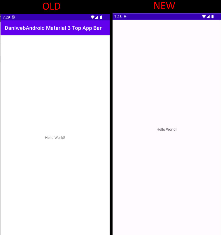
Material 3 Top App Bar
There are many variants of the Top App Bar:
- Center aligned.
- Small.
- Medium.
- Large.
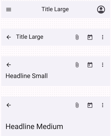
For this tutorial, we will add the center-aligned Top App Bar. Follow the steps below to add it to our app:
-
Open up activity_main.xml in the Design view.
-
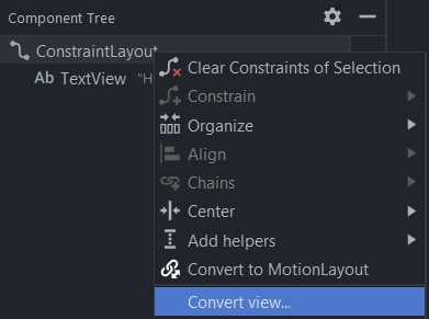
Under the Component Tree, Right-click on ConstraintLayout > Convert view….
-
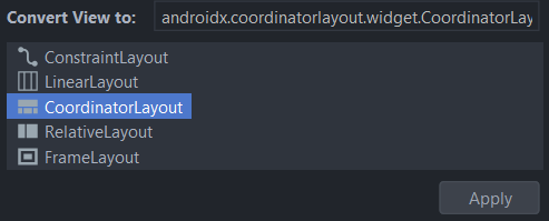
Select CoordinatorLayout > Apply.
-
Switch to Code view.
-
Add an
<AppBarLayout>child to the<CoordinatorLayout>.<com.google.android.material.appbar.AppBarLayout android:layout_width="match_parent" android:layout_height="wrap_content"> </com.google.android.material.appbar.AppBarLayout> -
Add a
<MaterialToolBar>child to<AppBarLayout>.<com.google.android.material.appbar.MaterialToolbar android:id="@+id/topAppBar" android:layout_width="match_parent" android:layout_height="?attr/actionBarSize" app:title="@string/page_title" app:titleCentered="true" app:menu="@menu/top_app_bar" app:navigationIcon="@drawable/ic_baseline_menu_24" /> -
Add the string resource below to strings.xml.
<string name="page_title">App Brand</string> -
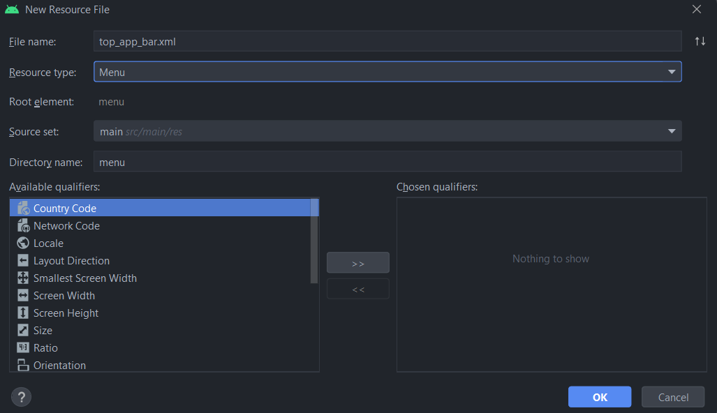
Create a new xml resource for the menu by right-clicking on res > New > Android Resource File. Use the configuration from the screenshot below, select OK.
-
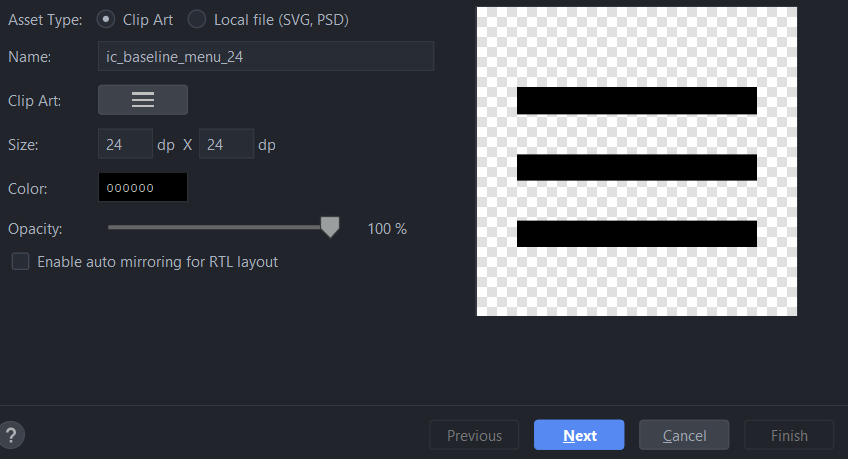
Create a new drawable for the navigation icon by right-clicking on drawable > New > Vector Asset. Use the configuration from the screenshot below, and then select Next > Finish.
-
Remove the default “Hello World!” TextView.
Run the App
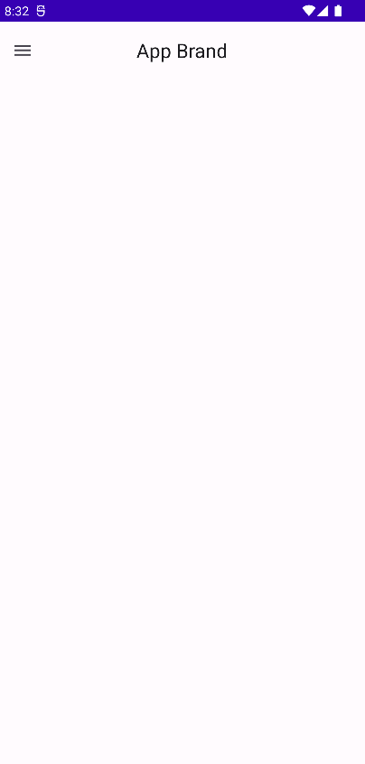
We are now ready to run the app, so run it now and we can see that we have a centered Top App Bar from the Material 3 library.
Solution Code
ic_baseline_menu_24.xml
<vector xmlns:android="http://schemas.android.com/apk/res/android"
android:width="24dp"
android:height="24dp"
android:viewportWidth="24"
android:viewportHeight="24"
android:tint="?attr/colorControlNormal">
<path
android:fillColor="@android:color/white"
android:pathData="M3,18h18v-2L3,16v2zM3,13h18v-2L3,11v2zM3,6v2h18L21,6L3,6z"/>
</vector>activity_main.xml
<?xml version="1.0" encoding="utf-8"?>
<androidx.coordinatorlayout.widget.CoordinatorLayout xmlns:android="http://schemas.android.com/apk/res/android"
xmlns:app="http://schemas.android.com/apk/res-auto"
xmlns:tools="http://schemas.android.com/tools"
android:layout_width="match_parent"
android:layout_height="match_parent"
tools:context=".MainActivity">
<com.google.android.material.appbar.AppBarLayout
android:layout_width="match_parent"
android:layout_height="wrap_content">
 <com.google.android.material.appbar.MaterialToolbar
    android:id="@+id/topAppBar"
    android:layout_width="match_parent"
    android:layout_height="?attr/actionBarSize"
    app:title="@string/page_title"
    app:titleCentered="true"
    app:menu="@menu/top_app_bar"
    app:navigationIcon="@drawable/ic_baseline_menu_24" />
</com.google.android.material.appbar.AppBarLayout>
</androidx.coordinatorlayout.widget.CoordinatorLayout>top_app_bar.xml
<?xml version="1.0" encoding="utf-8"?>
<menu xmlns:android="http://schemas.android.com/apk/res/android">

</menu>
strings.xml
<resources>
   <string name="app_name">DaniwebAndroid Material 3 Top App Bar</string>
   <string name="page_title">App Brand</string>
</resources>
themes.xml
<resources xmlns:tools="http://schemas.android.com/tools">
   <!-- Base application theme. -->
   <style name="Theme.DaniwebAndroidMaterial3TopAppBar" parent="Theme.Material3.DayNight.NoActionBar">
       <!-- Primary brand color. -->
       <item name="colorPrimary">@color/purple_500</item>
       <item name="colorPrimaryVariant">@color/purple_700</item>
       <item name="colorOnPrimary">@color/white</item>
       <!-- Secondary brand color. -->
       <item name="colorSecondary">@color/teal_200</item>
       <item name="colorSecondaryVariant">@color/teal_700</item>
       <item name="colorOnSecondary">@color/black</item>
       <!-- Status bar color. -->
       <item name="android:statusBarColor" tools:targetApi="l">?attr/colorPrimaryVariant</item>
       <!-- Customize your theme here. -->
   </style>
</resources>
build.gradle
plugins {
   id 'com.android.application'
   id 'kotlin-android'
}

android {
   compileSdk 31

   defaultConfig {
       applicationId "com.example.daniwebandroidmaterial3topappbar"
       minSdk 21
       targetSdk 31
       versionCode 1
       versionName "1.0"

       testInstrumentationRunner "androidx.test.runner.AndroidJUnitRunner"
   }

   buildTypes {
       release {
           minifyEnabled false
           proguardFiles getDefaultProguardFile('proguard-android-optimize.txt'), 'proguard-rules.pro'
       }
   }
   compileOptions {
       sourceCompatibility JavaVersion.VERSION_1_8
       targetCompatibility JavaVersion.VERSION_1_8
   }
   kotlinOptions {
       jvmTarget = '1.8'
   }
}

dependencies {

   implementation 'androidx.core:core-ktx:1.7.0'
   implementation 'androidx.appcompat:appcompat:1.4.0'
   implementation 'com.google.android.material:material:1.5.0-rc01'
   implementation 'androidx.constraintlayout:constraintlayout:2.1.2'
   testImplementation 'junit:junit:4.+'
   androidTestImplementation 'androidx.test.ext:junit:1.1.3'
   androidTestImplementation 'androidx.test.espresso:espresso-core:3.4.0'
}
Summary
We have learned how to add a Material 3 Top App Bar into our App. The full project code can be found at https://github.com/dmitrilc/DaniwebAndroidMaterial3TopAppBar
