Hi all

Is it possible to specify that NOTHING is allowed to come below an element?

It's like this, if have a menu on the left, and when i make the browser small enough, text starts getting below the menu, and I don't want it to.

I'd rather not create a useless spacer div, if possible.

I can specify a certain amount of padding or margin below the menu, but that's only a certain amount of pixels. It would be nice if i could tell this margin or padding to "go to the bottom of the browser window". But I don't know how to if this is possible.

Thx in advance
Greetings, Kenny.

Hi,

Its difficult to know what your problem is without seeing any code.

Do you have a height set on your menu? If you have then remove the height and your menu will grow vertically to fit your menu items.

If you don't want your menu to grow then you could use overflow:auto;

.navmenu
{
     overflow:auto;
}

This will add a scrollbar to your menu div where it is needed. Doesn't look very nice in my opinion though.

You can find out about overflow here http://css-tricks.com/the-css-overflow-property/

Hope this helps

No no, I don't want a scrollbar in my menu :P

My site is divided like this: horizontal titlebar and then three vertical bars -> 20% 60% 20%
In the center is the content (ofcourse), the left one contains the menu, the right one contains nothing.

Well, actually, these left and right sidebars don't exist, i just created a margin of 20% left and right on the content div and on the left i've put the menu. (float)

The point is, when the browser gets too small, this 20% of left margin starts getting smaller than the width of the menu, so text starts getting underneath the menu.

So what I want to do is keeping this text, or any content in the "content-div", from going under the menu (a list, or li element)

Hope this makes things a little more clear, if it doesn't I'll try to filter the relevant code and post it later on.

Greetings and thanks for trying to help.

Hi,

You could make your menu div fixed width as in pixels and leave your other divs as percentages. Just tweak your percentages to fit your layout and that should fix your problem and still allow your site to shrink to smaller browsers.

Cheers

Well, I thought about that too, but the problem is this: I have my menu connected with a 1pixel left border to a 1 pixel border on the bottom of the header.

So this connection has to be pixel perfect, and since I use "em" to define the size of my fonts, if someone has another standard font size, that line will come under or above that border.

Now this works cause i have zero margin under the header and above the menu.

Grtz

Hi K,

Can i get to look at your source?

I don't have time now, but I'll post it when I'm home, grtz.

<div id="header"> 
<div id="titel">Sitename</div> 
</div> 
 
<div id="menu"> 
<ul>
<li><a href="link" title="pagename" >Pagename</a></li> 
...
</ul> 
</div> 

<div id="content"> 
 some <p>'s and <h>'es...
</div>
#header
{
	border-bottom: 1px solid #E16E04;
	float: none;
	margin-left: 5%;
	margin-right: 5%;
	margin-top: 2%;
}

#menu
{
	float: left;
	margin-left: 5%;
	margin-right: 10px;
	font-weight: bold;
}

#content
{
	margin-top: 45px;
	margin-left: 20%;
	margin-right: 20%;
}

Ok, so would you like something like this?

|----------------header---------------|
|--menu--||--Content--||--side---|

and you want it liquid (to fit screen)?

Yes, well, except for the fact that "side" will not be an actual element but just right-margin for content.

And i don't want text or images or whatever elements to be placed under the menu when the content's left margin (20%) gets smaller than the width of the menu.

Let's say the width of the menu is a 100 pixels. When the browser window shrinks to 300px width, then the left margin of the content is only 60 px (20% of 300px = 60px). And then it's content will come underneath the menu, but I don't want that.

Hate coding fluid. Nevertheless. This is what you will need to do;

NB: I'ved striped all your content and just left the containers so you can see that its working

#header {
    border-bottom: 1px solid #E16E04;
	position:relative;
	width: 90%;

}

#wrapper {
	width: 100%;
	position:relative;
	padding: 2% 5%
}

#menu {
    float: left;
    font-weight: bold;
	width: 20%;
	background: red;
	height:100px;
}

#content {
	width: 60%;
	position:relative;
	left: 20%;
	background: blue;
	height:100px;
}
<!DOCTYPE html PUBLIC "-//W3C//DTD XHTML 1.0 Transitional//EN" "http://www.w3.org/TR/xhtml1/DTD/xhtml1-transitional.dtd">
<html xmlns="http://www.w3.org/1999/xhtml">
    <head>
        <meta http-equiv="Content-Type" content="text/html; charset=utf-8" />
        <link rel="stylesheet" type="text/css" media="screen" href="style.css" />
        <title>Firefuel</title>
    </head>
    <body>
        <div id="wrapper">
            <div id="header">
                <div id="titel">
                    Sitename
                </div>
            </div>
            <div id="menu">
            </div>
            <div id="content">
            </div>
        </div>
    </body>
</html>

Nop...

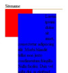
Content still goes under menu at small sizes, plus: menu gets overlapped.

Added some text and shrinked browser, check attached image for result.

But thanks for trying to help.

Any other idea's?

Simple

* {
	margin: 0;
	padding: 0;
}

#header {
    border-bottom: 1px solid #E16E04;
	position:relative;
	width: 90%;

}

#wrapper {
	width: 100%;
	position:relative;
	padding: 2% 5%
}

#menu {
    float: left;
    font-weight: bold;
	width: 20%;
	background: red;
	height:100px;
}

#content {
	width: 60%;
	position:relative;
	margin-left: 20%;
	background: blue;
	height:auto;
}

First of all, thank you for the quick and usefull replies.

I made a mistake in my previous post, i forgot to mention that i added a min width for the menu, so it wouldn't get too small for it's content.

It works like that as long as "min-width" is not specified for the menu.
If no min width is specified: browserwindow too small -> menu too small
If it is specified, then it shows the result like in the image in my previous post.

Edit: but on the other hand, maybe i should specify a min width for the wrapper instead of for the menu. If the whole site can't get too small, then the menu can't either.

Coding fluid is annoying indeed :p but I think it's a better practice, isn't it?

Grtz

I may have misunderstood your needs but i think this is what you are after.
Wrap your html in a container div give it an id of container or something helpful.
In CSS specify its height and overflow:hidden.
That way if any element go below the height of the div they will not be visible. but that does mean your viewers are going to miss information.

Also specifying a height in webpages is usually a very very very very veeeeeehhhhhhhheeeeery bad idea.

Ooops - just re-read this topic from start to finish and realise this is not helpful. However if you post up your current code i'll take a look.

Also specifying a height in webpages is usually a very very very very veeeeeehhhhhhhheeeeery bad idea.

Only reason height was specified in #menu was because we were testing something.

K!? To do what you wan't, I believe we gonna have to go JS. So basically we gonna have to get the width of #wrapper and if its less than (say 500) we change css of #menu to (e.g. 200px -basically you min-width) and change #content margin-left to 200px.

To do so, im going to use jquery. Here is an updated version of html

<!DOCTYPE html PUBLIC "-//W3C//DTD XHTML 1.0 Transitional//EN" "http://www.w3.org/TR/xhtml1/DTD/xhtml1-transitional.dtd">
<html xmlns="http://www.w3.org/1999/xhtml">
    <head>
        <meta http-equiv="Content-Type" content="text/html; charset=utf-8" />
        <link rel="stylesheet" type="text/css" media="screen" href="style.css" />
        <title>Firefuel</title>
        <!-- Attach jquery -->
        <script src="http://code.jquery.com/jquery-latest.js"></script>
        
		<script>
			//Change these varibles to what you want
			var container = ('#wrapper') // this is your main container
			var minwrapper = ('500'); //this is the minium wrapper size before we add width to the menu
			var minwidth = ('200px'); // add the minimum size you would like you menu to be
			
			$(window).resize(function() {
				var wrappersize = $(container).width();
				
				if(wrappersize <= minwrapper ) {
				    $('#menu').css('width', minwidth);
					$('#content').css('margin-left', minwidth);
				} else {
				    $('#menu').css('width','20%');
					$('#content').css('margin-left','20%');					
				}				  
			});            
        </script>
    </head>
    <body>
    	<div class="width">&nbsp;</div>
        <div id="wrapper">
            <div id="header">
                <div id="titel">
                    Sitename
                </div>
            </div>
            <div id="menu">
            </div>
            <div id="content">
            </div>
        </div>
    </body>
</html>

Update

Here is an improved version of the script

<script>
            /**
             * @author marc
             * Simple Resize
             * version: 0.2
             * http://www.stonewall.co.za
             * Changes include: Put everything in a function and added it to resize as well as page load
             * 
             */
            function resizeME(){
                var contentWrapper = ('#wrapper')
                var menuwidth = ('#menu')
                var minwrapper = ('200'); //this is the minium wrapper size before we add width to the menu
                var minwidth = ('200px'); // add the minimum size you would like you menu to be
                var defaultwidth = ('20') // this is our default menu percentage
                
                var wrappersize = $(menuwidth).width();
                var mainwidth = $(contentWrapper).width() / ('100') * $(defaultwidth);
                if (wrappersize <= minwrapper) {
                    $(menuwidth).css('width', minwidth);
                    $('#content').css('margin-left', minwidth);
                }
                else {
                    $(menuwidth).css('width', mainwidth);
                    $('#content').css('margin-left', mainwidth);
                }
            };
            
            $(document).ready(function(){
                resizeME()
            });
            
            $(window).resize(function(){
                resizeME()
            });
        </script>

Ok, first of all, sorry for the late reply, i just started with my internship so I have less time to continue with my own site.

Second, McNeato, thank you for putting your time and effort into this. I'm still going to continue trying to find a CSS solution to this, but if I don't, I have this as a backup, thank you for that ;).

I found some interesting articles at Smashing magazine (check it). I'm first going to check those articles, i think are 2 tips over there that might help solving my problem. ("Pegs: Automate Display: fixed++" and "CSS 100% Height")

Greets, K?!

Ps.: I am just starting as a web developer and I've only just heard about JQuery, that's why I'd prefer to keep it simple with XHTML and CSS.
I have a question about JQuery, is this something clients need to download, or is this automatically supported by all browsers?

Sigh...

I've been looking at several solutions, and there's always something about it that just doesn't make it work in my case.

Well, another solution was in JQuery too, so I'm starting to consider it. But what bothers me is the fact that some user might have JavaScript turned of, and then that solution won't work for them either. So I keep preferring a CSS solution.

I found this article too: Faking Minimum Margins. But, as far as I know, this only works if there is no element next to the side of the "minimum margin". Cause I think in my case, the content will be placed with a margin from the menu, not from the border of the browser window.

Be a part of the DaniWeb community

We're a friendly, industry-focused community of developers, IT pros, digital marketers, and technology enthusiasts meeting, networking, learning, and sharing knowledge.