Hi there,
I have a strange problems with margins. On this website http://antobbo.webspace.virginmedia.com/photography/home.htm I am trying to have some space between the top navigation and the red box. Now in my stylesheet containers.css the red box (class name picture_box_home) has margin:0 auto; which is rendered fine in all browsers.
On this test example instead http://antobbo.webspace.virginmedia.com/photography/testing/home.htm I gave the box margin:50px auto; but it works only in IE 7 and 8, and I don't understand why. Firefox and chrome seems to take no notice whatsoever of that. Is there anything I am missing I wonder?
And there's more: if I go over 80px the box snaps back up to the original position even in IE. It seems to accept any margin up to 80px, but if I go 90px it stops working...I am a bit confused I must admit...

thanks

Member Avatar for tawes01

Well with margin you can have one parameter: either "auto", # px, or # %. You have auto, which means the browser sets it. You have stumbled on something I sometimes call a "lucky error." This is an error in your code that only causes an error in the browser under certain conditions; these are quite annoying because you don't always test all the conditions. So just delete the "auto" and see if that works.

Hi tawes01,
thanks for that. From past experience and from what I read on the net you can have something like

margin:0 auto;

which center the element it is referred to and makes sure that the top and bottom margins are 0; I have never encounter a problem using that till now. If I do have

margin: auto;

doesn't that mean that all the margins will be taken care by the browser? I haven't tried yet (but sure I will) but if I remove auto then all the margins will be 0 which means that my box won't be centered anymore...

Member Avatar for tawes01

the auto means the browser sets the margins. you can set it to anything else you want if you don't have auto.

margin: 0 auto; is just saying:

margin-top: 0;
margin:-bottom: 0;
margin-left: auto;
margin-right: auto;

The browser takes the remaining space on the page and evenly distributes it to the left and right margins - centering the element. margin: 0 auto; is preferred over margin: auto; to keep the top and bottom margins at their default value of 0.

Regards
Arkinder

I see thank you for that. SO auto can then be mixed with other values as in

margin:50px auto;

I solved the problem adding some margin-bottom to the navigation menu rather than assign a margin-top to the box itself if that makes sense, but I'm slightly puzzled as to why when I have

margin:50px auto;

assigned to my red box it does work only in IE as mentioned...odd

Violet_82,

I dont agree with tawes01 answer. You can give margin as .class { margin:50px auto} and its works. I've analyzed the css codes of your page and detected a problem with your css code.

Solution is:
give a height value to .navigation_menu ul for example:
.navigation_menu ul {
height:100px;
list-style:none outside none;
}
and its all.

top margin for .picture_box_home will work fine.

Regards
Hafeez

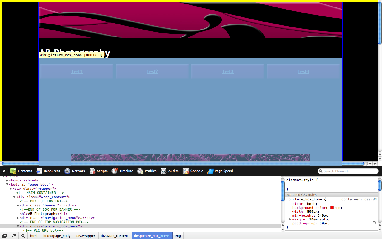
Well first off 50px isn't enough to move it. Have a look at the box model. Margin is outside of the element. So basically the amount of margin has to be the same as the space between the element and the element above it. On the first page you posted, try changing margin: 0 auto; to margin: 20em auto; . Take a look at the image I attached. The blue from the top of your image is margin. Now if you're thinking that this seems a little ridiculous for just adding space - it is. Go back to your original CSS for the box. However this time, add padding-top: 50px; .

.picture_box_home {
    clear: both;
    background-color: red;
    width: 800px;
    min-height: 540px;
    margin: 0px auto;
    padding-top: 50px;
}

You'll be able to see the results and difference for yourself.

A few notes:

The margin in the image below is going all the way up to your banner, but it's skipping over your navigation. This is one example of how using the float property removes an element from the normal flow of the page.

While I didn't include it in my previous post, which was an error on my part. Always include the unit for a value. margin: 0px auto; instead of margin: 0 auto; Regards
Arkinder

hi Violet_82,

As i told you in my previous post that is the simple solution. Please see the attached image, i've selected the red box and yellow bar is showing the given top-margin:50px

Its mean, its okay browsers are rendering the box with margin. Only problem is that .navigation_menu ul dont have height and list items are going out side of li. after .navigation_menu ul .picture_box_home start where browser is rendering the picture_box_home right after ul.

If you will give a proper height to .navigation_menu ul then browser will reserve the correct space before rendering the next element .picture_box_home in this case.

CSS Stylesheet is to make the page element easier for browsers not too complicated. Given a top-padding is not a good solution because .picture_box_home will remain in .navigation_menu ul

You should try to give the proper width and height to .navigation_menu ul so it will take place.


Thank You.

Hafeez

Given a top-padding is not a good solution because .picture_box_home will remain in .navigation_menu ul

.navigation_menu ul has a height of 0. An element can't be inside of something that "isn't" there. The floating li are still pushing the box down 140px (50px from height, 70px from margin).

Regardless margin should be used in this case. So ansaripk's suggestion is the better one. ^_^


Regards
Arkinder

cool now it is clearer, thanks for your help guys, always great : - )

Be a part of the DaniWeb community

We're a friendly, industry-focused community of developers, IT pros, digital marketers, and technology enthusiasts meeting, networking, learning, and sharing knowledge.