I have incorporated some excellent CSS/Jquery functionality into my site, but i'm having trouble editing the CSS to make the presentation more flexible.

The CSS builds a container, into which I can insert text and call via Jquery. I am using this for my help function. CSS also overlays an offset close button to close the CSS container with Jquery.

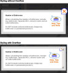
However, I in instances when I have lots of text to display believe I need to use the overflow element so the reader can view all of the text.

However, when I use the overflow element (either -x or -y with scroll, my offset close button is, as expected, contained within the container, and not offset.

I've attached a couple of screen prints to show the effect with overflow and without overflow. Does anyone have any suggestion of how to get around this, can I scroll the text only, for example. Many Thanks.

My css is

.popup_block{
	display: none; /*--hidden by default--*/
	background: #fff;
	max-height:300px;
	padding: 20px;
	border: 20px solid #ddd;
	float: left;
	position: fixed;
	top: 50%; left: 50%;
	z-index: 9999;
	overflow-y:scroll; overflow-x:hidden;	
}
img.btn_close {
	float: right;
	margin:-55px -55px 0 0;
}
The screenshots did not show up in your post if you could please post them again so we can see what is going on.

As for trying to fix it the only thing I might suggest without seeing the pictures is to change your "overflow-y:scroll; overflow-x:hidden;" to a more general overflow rating of "overflow: auto;".

Many thanks for your help.

FYI have have tried every combination of overflow, overflow-x and overflow-y but to no avail. I've even tried absolute and relative positions and everything in combination, again with no success.

I'm wondering if there's other CSS elements that could be used to get the desired effect.

This time I've inserted the images in a doc file - hope this works.

Many thanks for your help..

The screen shots display fine for me. Try messing with the z-index for the button, and if that does nothing you could try position the button absolutely. Keep in mind that you should give the containing popup a relative position if you do the latter.

If none of this makes a difference I will have to look into how the scroll is actually being displayed.

Regards,
Arkinder

You should use position attribute for close button. make sure it has position:absolute in css and then set the top:50px left:400px whatever fits your requirements.

Many thanks everyone,

Using the position absolute does indeed help me position the close button, however, no matter how I position the button or adjust the z-index(s), once overflow is set in the popup block, the close button is positioned behind the border of the popup block and I think the fade.

I suppose the close button is inheriting the overflow attribute from the popup block.

Be a part of the DaniWeb community

We're a friendly, industry-focused community of developers, IT pros, digital marketers, and technology enthusiasts meeting, networking, learning, and sharing knowledge.