I have a website that looks okay at 1300 pixels: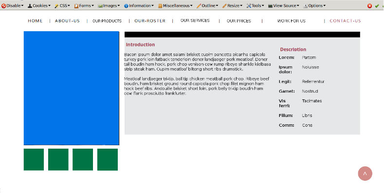
At 1200 pixels problems start to occur: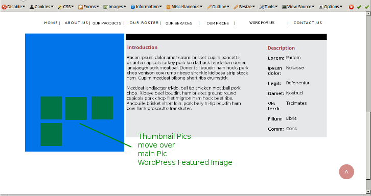
At 550 pixels I'm losing text and Menus.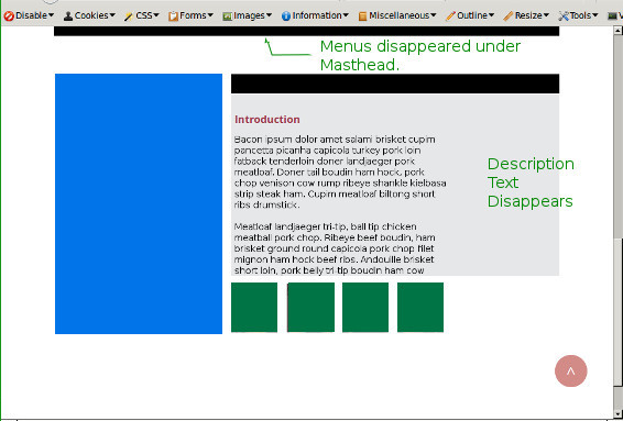
I have a website that looks okay at 1300 pixels:
At 1200 pixels problems start to occur:
At 550 pixels I'm losing text and Menus.
Jump to PostIs it possible to get the "featuredimage" div (in blue) so that it aligns to the bottom of the "memberinfo" div?
Likely, but without seeing your code I doubt someone can help you.
I started this thread in a bit of a hurry.
I'll update with some CSS code when I can.
Thanks, that helps. (not being faceteous!)
The site I'm taking over has a Style sheet called "responsive.css" which enumerates different CSS definitions for the same classes under different media sizes.
Hence my lack of CSS styling code: each class is defined multiple times.
However, I do have one issue that I wouldn't mind getting cleared up.
The thumbnail strip has been sorted but it is displayed at the bottom 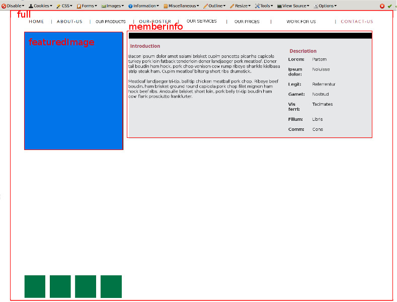
What CSS styling can I apply to make sure it is rendered below the "memberinfo" div or tight below the "featuredimage" div?
Sorry, as you were.
I found the issue: the "memberinfo" height was set to 100%.
Is it possible to get the "featuredimage" div (in blue) so that it aligns to the bottom of the "memberinfo" div?
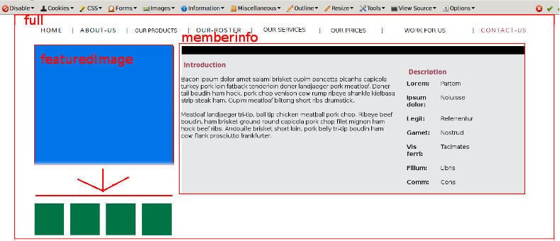
Is it possible to get the "featuredimage" div (in blue) so that it aligns to the bottom of the "memberinfo" div?
Likely, but without seeing your code I doubt someone can help you.
If you don't have/want yet a webserver (for whatever reason), you can use Dropbox as a server to show your static page(s) and its assets and thus code to us.
http://www.creativepro.com/article/how-to-use-dropbox-a-web-server-3-easy-steps
We're a friendly, industry-focused community of developers, IT pros, digital marketers, and technology enthusiasts meeting, networking, learning, and sharing knowledge.