floatingDivs 21 Junior Poster

Hi kukula,

It's time to rewrite the site. You've done it using some very unsupported formats that appear to only be working with Chrome.

Example

img[height=223] { ... }

Either make sure to use pixels like this

img[height="223px"] { ... }

or try to NOT use those types of things.

floatingDivs 21 Junior Poster

Hi Violet_82,

So I took a look at the mobile version of site (it looks horrific) and the desktop version (looks good except for the lack of clearing at the bottom [the image goes past the "wrapper"]).


I'll be blunt because I feel you are going down the wrong path.

First off, your navigation looks really bad on the mobile browser. Here's why: you are floating your list on the desktop version so it's naturally pulling in the float style from the containers.css file even when you are in a mobile device.

What you need to do is turn off the floats in a mobile device (you shouldn't float things in mobile devices; not all of them support floating and it looks terrible in smaller viewports).

Here's how you do that:

Take a look at your containers.css file and find out where you've put floats. Go into your mobile.css file and (select the same class [i.e. #container <-- example]) override it.

Floated element in containers.css

#container { float: left; }

Disable floating of element in mobile.css

#container { float: none; }

Do it for all your floated elements.


Secondly, override your absolute positioning in the mobile stylesheet. Do it the same way as the above mentioned override.

Absolutely positioned element in containers.css

#main_picture img { position: absolute; }

Relatively positioned element in mobile.css

#main_picture img { position: relative; }

From what I'm seeing in …

floatingDivs 21 Junior Poster

Are you adding that other stylesheet AFTER the mobile CSS? If so, that's your cause. CSS is order-based, meaning if you first apply the mobile CSS and THEN your regular CSS (and both style the same divs), obviously the desktop CSS will override the mobile CSS.

Basically, your mobile CSS should be the LAST thing in your </head> since it OVERRIDES desktop CSS (if the criteria -- in this case a max-width of 480px -- is met).

Let me know if that doesn't make sense.

floatingDivs 21 Junior Poster

We can't view your website. My guess is that you are running it on a local server off your desktop and you decided to turn off the PC (or just the server).

Can you put this up on a 99.9% uptime server? Thanks.

floatingDivs 21 Junior Poster

ah ok I see, it's because I saw the xhtml doctype. So to sum up, if I use html5 (whose doctype declaration is <!DOCTYPE html> ) it should work. What I seem to understand from all this thread (and thank you for that) is that essentially I can have a "normal" css for the desktop version and a mobile one using the @ rule.
I was also reading something about liquid layout today, so I wonder if that can help as well. I usually go for fixed width, but I suppose I can change the layout of the website in the @ rule from fixed width to liquid, that should work because the page should resize automatically to fit different screens I presume...

Yes. You can use fixed width for a desktop version and fluid width for a mobile version.

Also, you don't need to put all your mobile (liquid) CSS into a <style> tag.

You can do the following as well (to link to a CSS stylesheet for mobile browsers:

<link rel="stylesheet" media="only screen and (max-width: 640px)" href="/static/css/index_page_mobile.min.css" />
floatingDivs 21 Junior Poster

floatingDivs, thank you very much for all your help, much appreciated. I had a look at your media rule, everything is clear. Do you know of any resource I can have a look to read more about it?

I will try to apply that to my website then. One question only. You used xhtml, if I use html4 strict, would that work as well?

Hi Violet_82,

By far the best resource I stumbled upon was HTML5Rocks "Mobifying your site".

http://www.html5rocks.com/en/mobile/mobifying/

I did not use xhtml, I used html5 which is a direct competitor IIRC. That's the biggest thing in making sure you're site comes out looking great on mobile screens. It's as simple as switching up your Doctype and running it through a validator to make sure it's 100% valid syntax/declarations.

The biggest thing will be going from

<img src="..." alt="..." />

to

<img src="..." alt="...">

since I think HTML5 doesn't require the slash to end the tag. Plus, you get access to some very cool things (rounded borders supported by most browsers, <nav> and <header> tags, etc.)

floatingDivs 21 Junior Poster

Hi Violet_82,

I spent about 15 minutes trying to set up an example for you.

Here's the link to the uploaded image: http://illinois.edu/1083/violet.html

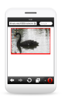
Obviously, all you see is the image (and no border, etc) on the desktop. Viewing it in a mobile device, on the other hand, will show you everything you've styled. I used the Opera Mini link you've repeatedly posted.

So, the very first thing you need to realize is when developing for a mobile device, you shouldn't be using pixels but rather PERCENTAGES. With your code, the div containing the image has a width of (over) 1000px but the device you are viewing it on has much less. Thus, it's trying to render all 1000px on its 320px screen (guess) and it's resizing everything to fit the 1000px into the screen.

For media devices, you should be using 100% of the screen for most things (thus creating a single column, fluid layout (meaning a 320px screen views 320px (#main_picture) while a 480px screen views 480px, etc.)

Here's the code and take a look at my CSS for the mobile device.

<!DOCTYPE html PUBLIC "-//W3C//DTD XHTML 1.0 Strict//EN"
    "http://www.w3.org/TR/xhtml1/DTD/xhtml1-strict.dtd">

<html xmlns="http://www.w3.org/1999/xhtml">
<head>
  <meta http-equiv="Content-type" content="text/html; charset=us-ascii" />

  <title>test</title>
  <meta name="viewport" content="width=device-width, initial-scale=1, maximum-scale=1">
  <style type="text/css">
    @media all and (max-width: 480px) {
      #main_picture { background:red; width: 90%; height: auto; border: 2px solid red; margin: 0 auto; }
      img { width: 100%; }     
    }
  </style>
</head>

<body> …
floatingDivs 21 Junior Poster

Newsletter dont support external css.. that is the prob i face.. if you have any other suggestion plz share it...

Thanks for the pre reply..Advance thanks for the post-reply

I would say you can't expect to do that and have it be compatible across all email clients. You shouldn't be using positioning, floats, etc. in email clients as many don't support them.

My $0.02

floatingDivs 21 Junior Poster

Oh my GOD! How did I not freaking notice??? Change your Doctype to HTML5, meaning get rid of the very top line of your code

<!DOCTYPE HTML PUBLIC "-//W3C//DTD HTML 4.01//EN" "http://www.w3.org/TR/html4/strict.dtd">

and replace it with

<!DOCTYPE html>

Mobile browsers don't render well without the HTML5 doctype. I had to take a look at my University's mobile website (which I helped create) to realize that we were using HTML5 doctype to get properly sized content.

Try the HTML below.

<!DOCTYPE html>
<html>
	<head>
		<meta http-equiv="Content-type" content="text/html; charset=utf-8">
		<meta http-equiv="Content-Language" content="en">
		<meta name="description" content="Digital photography">
		<title>test</title>
		<meta name="viewport" content="width=device-width, initial-scale=1, maximum-scale=1">
		<style>
		@media only screen and (max-device-width: 480px){
		#main_picture {
		height: auto;
		width: 100%:
		}
		#main_picture img {
		width: 100%;
		}
}
</style>
		

	</head>

	<body>
		<div id = "main_picture" style ="width:700px; height:450px; border:3px solid BLACK; margin:0 auto;">
		</div>
		<p>
		<img src = "home_0.jpg" alt = " " class = "active">
		</p>
	</body>
</html>
dantinkakkar commented: :P I failed to notice, too! :D :) +4
floatingDivs 21 Junior Poster

While the image (and navigtion) are properly resized to fit the entire site in the screen, the #main_picture div is set a definite width (750px wide, 400px high or something like that...).

Try the code below and see if it fixes things.

<!DOCTYPE HTML PUBLIC "-//W3C//DTD HTML 4.01//EN" "http://www.w3.org/TR/html4/strict.dtd">
<html>
	<head>
		<meta http-equiv="Content-type" content="text/html; charset=utf-8">
		<meta http-equiv="Content-Language" content="en">
		<meta name="description" content="Digital photography">

		<link rel = "stylesheet" type = "text/css" href = "css/styles.css">
		<link rel = "stylesheet" type = "text/css" href = "css/containers.css">
<script type = "text/javascript" src="https://ajax.googleapis.com/ajax/libs/jquery/1.7.1/jquery.min.js"></script>

		<script type = "text/javascript">

			function changeImages(){

				var active_image = $("#main_picture .active");

				var next_image = ($("#main_picture .active").next().length > 0) ? $("#main_picture .active").next() : $("#main_picture img:first");

				next_image.css('z-index',2);

				active_image.fadeOut(1500,function(){

					active_image.css('z-index',1).show().removeClass('active');

					next_image.css('z-index',3).addClass('active');

				});

			}

$(document).ready(function(){

	setInterval('changeImages()',3000);
});


		</script>

		<title>Lorem ipsum</title>
    <meta name="viewport" content="width=device-width, initial-scale=1, maximum-scale=1">
<style type="text/css">
@media only screen and (max-device-width: 480px){
#main_picture {
height: auto;
width: 100%:
}
#main_picture img {
width: 100%;
}
}
</style>
	</head>

	<body>

		<div class = "wrapper">

			<div class = "heading_1">

				<h1>Lorem ipsum</h1>
			</div><!--END OF heading_1 -->

		<div class = "navigation">
			<ul>
				<li><a href = "#">Home</a></li>
				<li><a href = "#">Travels</a></li>
				<li><a href = "#">Portfolio</a></li>

			</ul>

		</div><!--END OF navigation-->
		<div class = "clear">
		</div><!--END OF clear -->

		<div class = "nav_bar">
			<img src = "images/bar.jpg" alt = "">
		</div><!--END OF nav_bar-->

		<div id = "main_picture">
			<img src = "images/homepage/home_0.jpg" alt = " " class = "active" style = "width:700px;height:450px">
			<img src = "images/homepage/home_1.jpg" alt = " ">
			<img src = "images/homepage/home_2.jpg" alt = " "> …
floatingDivs 21 Junior Poster

Hi Violet,

Try this HTML page as your test for Opera mini. Replace the current one you have up and view it in your mobile browser(s).

<!DOCTYPE HTML PUBLIC "-//W3C//DTD HTML 4.01//EN" "http://www.w3.org/TR/html4/strict.dtd">
<html>
	<head>
		<meta http-equiv="Content-type" content="text/html; charset=utf-8">
		<meta http-equiv="Content-Language" content="en">
		<meta name="description" content="Digital photography">

		<link rel = "stylesheet" type = "text/css" href = "css/styles.css">
		<link rel = "stylesheet" type = "text/css" href = "css/containers.css">
<script type = "text/javascript" src="https://ajax.googleapis.com/ajax/libs/jquery/1.7.1/jquery.min.js"></script>

		<script type = "text/javascript">

			function changeImages(){

				var active_image = $("#main_picture .active");

				var next_image = ($("#main_picture .active").next().length > 0) ? $("#main_picture .active").next() : $("#main_picture img:first");

				next_image.css('z-index',2);

				active_image.fadeOut(1500,function(){

					active_image.css('z-index',1).show().removeClass('active');

					next_image.css('z-index',3).addClass('active');

				});

			}

$(document).ready(function(){

	setInterval('changeImages()',3000);
});


		</script>

		<title>Lorem ipsum</title>
    <meta name="viewport" content="width=device-width, initial-scale=1, maximum-scale=1">
<style type="text/css">
@media only screen and (max-device-width: 480px){
#main_picture img {
width: 100%;
}
}
</style>
	</head>

	<body>

		<div class = "wrapper">

			<div class = "heading_1">

				<h1>Lorem ipsum</h1>
			</div><!--END OF heading_1 -->

		<div class = "navigation">
			<ul>
				<li><a href = "#">Home</a></li>
				<li><a href = "#">Travels</a></li>
				<li><a href = "#">Portfolio</a></li>

			</ul>

		</div><!--END OF navigation-->
		<div class = "clear">
		</div><!--END OF clear -->

		<div class = "nav_bar">
			<img src = "images/bar.jpg" alt = "">
		</div><!--END OF nav_bar-->

		<div id = "main_picture">
			<img src = "images/homepage/home_0.jpg" alt = " " class = "active" style = "width:700px;height:450px">
			<img src = "images/homepage/home_1.jpg" alt = " ">
			<img src = "images/homepage/home_2.jpg" alt = " ">
		</div><!--END OF main_picture -->

		</div><!-- END OF wrapper -->

	</body>

</html>
floatingDivs 21 Junior Poster

Well, assuming they are pasting in an HTML page, that's to be expected. It's also to be expected if you are using an iFrame to display their content. On the other hand, if all you are doing is displaying what THEY WROTE into the textarea (and you are 100% sure they didn't write html tags, you must be inserting it in some way we don't have any idea about.

floatingDivs 21 Junior Poster

What if you add this meta tag under your TITLE (<title>blah blah blah</title>) attribute.

<meta name="viewport" content="width=device-width, initial-scale=1, maximum-scale=1">
floatingDivs 21 Junior Poster

Hi Violet_82,

Try something like this (make this the VERY LAST style in your head)

<style type="text/css">
@media only screen and (max-device-width: 480px){
#main_picture img {
width: 100%;
}
}
</style>
</head> NOTICE HOW THAT STYLE IS THE LAST THING?

Once you upload it, try to view it in the browser again. Let me know the results!

floatingDivs 21 Junior Poster

Set the following CSS to fix the layout issues (especially the footer).

#footer-container { clear: both; }

Then, add the following div underneath <div id="text"> in <div id="boxcontainer">

<div style="clear:both;"></div>

So it should look something like this:

<div id="image"><img align="LEFT" src="http://ocklaw.com/new/wp-content/themes/ocklaw/images/pic2.png"></div>
<div id="text">Request more information from OCK&Associates </div>
<div style="clear:both;"></div>
floatingDivs 21 Junior Poster

Hmm. Not had a reply for a long time. No help? The boxes need floating but this is puzzling me. Been trying different things all day and nothing works (Obviously removing the <div align="center"> first)!

Let me know

Hi zobadof,

After reading your last two posts, I feel like I need to give you a lecture in being thankful for whatever help you do get -- rather than pushing for more through manipulative comments (ie. "haven't had a reply in a long time") -- because right now it seems you want Daniweb members to do the site for you. If so, that's fine but please list a price you are willing to pay. Secondly, have you looked at any HTML/CSS sites to learn modern practices (as I mentioned before)? I doubt you have and your page structure is a huge mess to work with at the moment. Consider going to http://css-tricks.com/ and learning about how to layout a web page rather than "winging it" and coming up with the atrocity you've come up with.

I spent the last fifteen minutes re-working your entire page. Don't bother thanking me as I won't jump back to read this (or any) of your future questions for this site. You can continue hacking away at the site and messing it up (thus requiring more questions down the road) or you can take a couple hours out of your day, read up on modern practices, and continue coding a usable (or …

floatingDivs 21 Junior Poster

I used what you said. The other stuff messed it all up and moved things around everywhere. Can you please send the CSS / HTML file as a full with your code included. That'll be easier I think.

Cheers!

Sure. I'll give you my file in two minutes.

EDIT: Your site appears to be working fine...what exactly is the problem? Is it an IE problem?

EDIT2: It's an IE problem only, right? If so, it's because you have to use px when using positioning.

In your style.css file, under #logo2, you've set the following style:

#logo2 { right: 2; }

and here's what it should be:

#logo2 { right: 2px; }
floatingDivs 21 Junior Poster

So I just checked your site after applying MY RECOMMENDED CSS CHANGES and the site fully functions. The problem is you haven't applied everything I mentioned above (in my first post in this thread). One of my monitors is 2048x1152 and the site looks perfect in it and if I resize it to take up half my monitor (or a third, or a fourth), it stills works PERFECT.

APPLY ALL THE CHANGES I LISTED ABOVE!

floatingDivs 21 Junior Poster

Cheers for that. When I zoom/out it all messes up, any idea's? The whole site comes out of shape. Let me know.

Yea, it's because of all the positioning you used. HTML should come as naturally free-flowing as possible to ensure that DOES NOT happen.

My advice? Re-work the site without constantly setting position everywhere.

floatingDivs 21 Junior Poster

Hi zobadof,

I've made the page look very similar to the PNG example you posted. Here's the code I used to do it.

#main { position: relative; }
#marq { width: 752px; }
#logo2 { right: 0; top: 127px; }
#donate { position: absolute; right: -70px; top: -35px; opacity: 0.5; }

May I ask, are you new to HTML/CSS? The practices you are using (position everything, outdated tags, freaking marquees, etc.) is really what stagnated the web for a long time. IF you plan to make a living from web designing you should really try to look up modern HTML practices.

floatingDivs 21 Junior Poster

Can you show the entire HTML page? Even better, can you give us a link to a hosted version of the page? The CSS is very limited and we can't help much with it.

floatingDivs 21 Junior Poster

OK Violet82,

You wanted to get rid of the negative margin, right? The way to do it was with my suggestion.

Below all your previous CSS, add the following two styles.

.main_picture { clear: both; }
.main_picture img { margin: 0; }

----------

HERE'S A DETAILED EXPLANATION

<div class = "navigation">
			<ul>
							<li><a href = "#">Home</a></li>
							<li><a href = "#">Travels</a></li>
							<li><a href = "#">Portfolio</a></li>
			</ul>

		</div><!--END OF navigation-->
		<div class = "clear">
		</div><!--END OF clear -->

		<div class = "nav_bar">
			<img src = "images/bar.jpg" alt = "">
		</div><!--END OF nav_bar--> <-------------------------***NEEDS TO BE CLEARED AS  ITS FLOATED TO THE RIGHT

		<div class = "main_picture"><------------------------------***DOES THE CLEARING
			<img src = "images/homepage/home_1.jpg" alt = ""><--------------***SINCE THE .main_picture DIV CLEARS THE .nav_bar DIV, NO NEED TO USE NEGATIVE MARGIN
		</div><!--END OF main_picture -->
floatingDivs 21 Junior Poster

Hi Violet_82 (again),

I think I've given you the lecture on clearing floats about 100x. :P

Remove the margin from the .main_picture img (or set it to margin: 0; as below)

Then, set a clear on the .main_picture div.

That ought to fix it.

.main_picture { clear: both; }
.main_picture { margin: 0; }
floatingDivs 21 Junior Poster

I know I'm late, but here's a pretty good technique of getting around faux columns (and reliance on JavaScript/jQuery).

http://offshootinc.com/blog/2011/11/23/getting-100-column-height-with-css/

The only downside is lack of support in IE6, but who cares?

floatingDivs 21 Junior Poster
#header-wrapper { float: left; }

I've attached an image to show you that it's fixed in FF10 if you apply my CSS change above.

I posted the solution yesterday afternoon, but for some reason it didn't appear? Anyways, good luck with the blog!

Q8iEnG commented: Cheers! +3
floatingDivs 21 Junior Poster

Hi al2henry,

The link I posted actually explains what needs to be done to clear (hint hint) the problem where elements underneath a floated element overlay it. Sticking 3 break tags worked -- that's great -- but it's not a great solution in general.

Also, I'm viewing the site in IE9 right now and it's not working properly.

Lastly, an ID has to be unique otherwise you're breaking validation rules. For instance, right now you have two divs with the id navBar and that's not good.

That's all I saw wrong from a general look around.

Glad to see it helped.

floatingDivs 21 Junior Poster

Hi Alan (al2henry),

You should familiarize yourself with CSS floats.

Here's what you should do (the ONLY thing you change).

#navBar {
float: left;
margin: 0;
width: 21%;
}
</div>
<!--end navbar -->

<div style="clear:both;"></div> <--// Add this under the "navbar" div to "clear" the floats (you'll learn about that when you read the post I've linked to above.

What the code above does is remove the margin-right (79%), adds a float on the left navigation, and sets it width to 21%.

floatingDivs 21 Junior Poster

I'm kinda shaking my head and laughing my ass off.

PF2G was writing HTML/CSS tutorials just two months ago and when a couple poster made note of his mistakes / things he left off, he couldn't take the criticism and went off on them. However, the guy who writes tutorials can't even fix such a simple issue?

/rant

floatingDivs 21 Junior Poster

There is a neat way to get around having to use dozens upon dozens of media queries.

Use one media query (check if window size is less than 800px wide [for instance]). If it is less than 800px wide, rather than using a set width (I'm guessing you have a width of 100px for the page), set the width to 100%.

floatingDivs 21 Junior Poster

Is this your page?

http://www.directsellinglive.com/index.html (does work)

I'm guessing you guys use a .htaccess file to allow .php precedence over .html files.

http://www.directsellinglive.com/index.php (doesn't work)

Chances are your index.php page is empty (nothing in there). Go check and report back with the results. How did it happen? No idea, but it did. Check the logs to see if you've been hacked.

floatingDivs 21 Junior Poster

13 is an error because the levels of dereferencing are wrong.

Since i is an int and p is a pointer to an int, no matter what else you do, you have to have exactly one more * than &. Just count them first. Don't worry about the order of the * and the &. If a * in front a p turns a p into an int, then if you throw in a &, that puts it back to a pointer. The other side of the equation is i, which an int, so you have an int on one side and a pointer on the other. Hence error.

18 has a q and a p. They're both the same "level" of address (a pointer to an int). You have a & and a *, or in other words equal numbers of them. Hence no error. All of this is without even looking at the order of operations of which operator does what first, which frankly I can't remember what that is. The point is that I didn't have to on this one. cout << p should print out 0x1080 in your example. cout << *p would print out 5.


As far as q goes, address 0x1088 will contain 0x1080, just as address 0x1084 will contain 0x1080.

*q means take the value stored at 0x1080, which would be 5.
&q would be the address of q, which is 0x1088.
q would be 0x1080, which is what …

floatingDivs 21 Junior Poster

OK, so why is 13 an error and why is 18 not an error? I see the code and realize that pointers p and q point to the same location, but WHY? Is q not being assigned the CONTENT at the address of p? If so, wouldn't outputting (cout << p) print out 5? Then, *p would also be 5?

Let's say int i is allocated the address 1080. Then, pointer p is allocated the address 1084 and pointer q is allocated the address of 1088.

The value (contents) of p is set to 1080 (meaning it points to int i and dereferences the value 5). Is the address of pointer q not assigned the contents at the address of p?

val(address)[value]
-------------------
i(1080)[5]
p(1084)[1080]
q(1088)[5]

Or am I missing something?

floatingDivs 21 Junior Poster

Hey everyone (especially Narue!),

I've ventured over to the C++ board again. I've been reading my C++ book (Data Structures and Algorithms in C++) again and want to fully grasp the concept of pointers. In the back of each chapter, a couple of exercises are available and I'm attempting to do them.

For the very first question, it's simply asking to figure out which assignment would cause compilation errors but unfortunately I can't find the solutions in the back of the book or online. :(

Q: If i is an integer and p and q are pointers to integers, which of the following assignments cause a compilation error?

a. p = &i; No error as p is assigned the address of i
b. p = *&i; Error as p is assigned the contents at the address of i
c. p = &*i; Error as p is assigned the address of the value at i
d. i = *&*p; No error as i is assigned the contents of the address containing the contents of p
e. i = *&p; No error as i is assigned the contents at the address of p
f. i = &*p; Error as i is assigned the address of the contents at p
g. p = &*&i; No error as p is assigned the address of the contents held at the address of i
h. q = *&*p; Error as q is assigned the contents …

floatingDivs 21 Junior Poster

You're looking to use opacity, I believe.

floatingDivs 21 Junior Poster

Set vertical-align for the class .wt to top.

.wt { vertical-align: top; }

floatingDivs 21 Junior Poster

I'm assuming you are using Google Custom Search.

If so, there's an option to receive results "inside" the current page.

floatingDivs 21 Junior Poster

There are two great options.

TinyMCE - http://www.tinymce.com/
CKEditor - http://ckeditor.com/

If you want more support, I'd suggest TinyMCE. If you want accessibility, CKEditor is said to be 100% accessible (or close to) and uses ARIA.

floatingDivs 21 Junior Poster

Hi guys,

I need help setting up Google's Custom Search for a unique experience.

I've got two views for an app:

http://mysite.com/calendar/month/7 and http://mysite.com/calendar/grid/7

What I want to do is have the ability to search BOTH views using ONE Google Custom Search because they contain the same events, just with a different view.

I've tried using the Google operator inurl by including both sites

value="inurl:http://mysite.com/calendar/month/7 inurl:http://mysite.com/calendar/grid/7"

but that just breaks the search.

Is there any way to do it?

floatingDivs 21 Junior Poster

No, you can't use variables or placeholders in CSS. Why would you even want to, though?

Using PHP, it's as simple as assigning a second class (.green for green background, .blue for blue background, etc.) and you should be covered.

floatingDivs 21 Junior Poster

Add the attribute align="center" to the footer table.

Also, the site is 7-8 years old I'm guessing...it uses REALLY old HTML.

floatingDivs 21 Junior Poster

The following code appears to fix IE9 issues...

<!DOCTYPE html>
<html><head><style type="text/css">
body {
	background-color: #000;
}
.white {
	color: #FFF;
}
.heading {
	color: #2B5CBB;
}
a:link {
	color: #000;
	text-decoration: none;
}
a:visited {
	text-decoration: none;
	color: #999;
}
a:hover {
	text-decoration: underline;
	color: #FFF;
}
a:active {
	text-decoration: none;
	color: #FFF;
}
</style>
<title>Aces For Charity | Home</title>
</head><body>
<table width="100%" border="0" cellspacing="0">
  <tr>
    <td colspan="2">&nbsp;</td>
  </tr>
  <tr>
    <td height="231" align="center" valign="middle" 

background="http://www.acesforcharity.com/images/header_bg.gif"><img 

src="http://www.acesforcharity.com/images/aceslogo.png" width="350" height="159"></td>
    <td width="669" height="235" align="center" valign="bottom" 

background="http://www.acesforcharity.com/images/header_img.jpg">&nbsp;</td>

  </tr>
  <tr>
    <td width="100" height="40" colspan="2" align="center" valign="middle" 

background="http://www.acesforcharity.com/images/menu_bg.jpg"><table width="100%" border="0" cellspacing="0">
      <tr>
        <td width="12%"><div align="center"><strong><a href="index.html">Home</a></strong></div></td>
        <td width="13%"><div align="center"><strong><a href="events.html">Events</a></strong></div></td>
        <td width="16%"><div align="center"><strong><a 

href="registration.html">Registration</a></strong></div></td>

        <td width="25%"><div align="center"><a href="hands.html"><strong>Poker Hand 

Rankings</strong></a></div></td>
        <td width="19%"><div align="center"><a href="rules.html"><strong>Tournament Rules</strong></a></div></td>
        <td width="15%"><div align="center"><a href="contact.html"><strong>Contact Us</strong></a></div></td>
        </tr>
    </table></td>
  </tr>
  <tr>

    <td colspan="2">&nbsp;</td>
  </tr>
</table>
<table width="100%" border="0" cellspacing="0">
  <tr>
    <td>&nbsp;</td>
    <td><h1 class="heading">Welcome to Aces For Charity!</h1></td>
  </tr>
  <tr>

    <td><img src="http://www.acesforcharity.com/images/try1.png" width="340" height="369"></td>
    <td><strong class="white">Need to host a fundraiser? Aces For Charity will help! We   organize poker 

tournament fundraisers for non-profit organizations,   companies, families, clubs and more. Make your fundraiser 

fun and   successful with our Texas Hold'em Poker Tournaments! Texas Hold'em is   increasingly becoming a very 

popular game and is played by many people   of all ages. Aces For Charity will provide well trained, 

professional,   courteous poker dealers along with poker tables, chips and cards. With   our network of hundreds 

of poker players in the Central Florida area we   make …
floatingDivs 21 Junior Poster

Hi Violet_82,

The answer is very simple. Chances are you are assigning specific (pixel-based) widths to various divs and lists. So, let's say you gave the div containing your social media information a width of 150px (inside the sidebar div). Let's also assume you gave your main content area ("content" + "sidebar") a width of 75%/25% of the parent container. As you continue to resize the browser and make it smaller, the proportions between the "content" and "sidebar" divs remain relatively the same because of the "liquid" widths (75%/25% of whatever the browser's window size is), but the social media wrapper has a FIXED width of 150px, so no matter how small the window gets the social media div will be 150px. Assuming that 75%/25% ratio is intact and the browser width is < 600px (so sidebar is less than 150px), it's bound to push the social media icons down or ruin the layout of your site.

If I get some time tonight, I'll make it clear (as I'm sure the above doesn't make sense). Basically, if you want it to look good in resized windows, it may be time to use percentage based widths in favor of pixels.

floatingDivs 21 Junior Poster

It doesn't have to be a div. It can be a break tag (<br />), a span tag, or any other tag. It's just an attribute that resets anything following it to a non-floating position (the default value for float is none).

floatingDivs 21 Junior Poster

Something like this is probably what you are looking for...

http://www.blueprintcss.org/

floatingDivs 21 Junior Poster

After something's been floated, it has to be cleared on the SAME level. So, after the div with class paragraph, create yet another div and give it a class clear. NOTHING GOES BETWEEN THE STARTING TAG AND ENDING TAG OF A CLEAR!

The CSS style is a simple clear:both;

<div class="paragraph">...</div>
<div class="clear"></div>

floatingDivs 21 Junior Poster

The reason your UL isn't receiving CSS is because you're trying to select TWO ULs.

#n ul should be ul#n

floatingDivs 21 Junior Poster

Something like this is what you're probably looking for.

<!DOCTYPE html>
<html lang="en">
	<head>
		<style type="text/css">
			ul {							
				height: 30px;
				line-height: 30px;
				margin: 0;
				padding: 0;
			}
			ul li {
				border: 1px solid #444444;
				display: inline;
				float: left;	
				height: auto;
				line-height: 30px;
				margin-right: 18px;
			}
			ul li:first-child {
				
			}
			ul li a {
				border: none;
				display: block;
			}
			ul li a:first-child {
				
			}
			ul li ul {				
				height: auto;
				line-height: normal;
			}
			ul li ul li {
				border: none;
				display: block;
				float: none;
				margin: 0;
				padding: 0;
			}
			ul li ul li a {
				border-top: 1px solid #444444;
				display: block;
				width: 100%;
			}
		</style>
	</head>
	<body>
		<ul>
			<li>
				<a href="#">Menu 1</a>
				<ul>
					<li><a href="#">Submenu 1 Link 1</a></li>
					<li><a href="#">Submenu 1 Link 2</a></li>
					<li><a href="#">Submenu 1 Link 3</a></li>
					<li><a href="#">Submenu 1 Link 4</a></li>
				</ul>
			</li>
			<li>
				<a href="#">Menu 2</a>
				<ul>
					<li><a href="#">Submenu 2 Link 1</a></li>
					<li><a href="#">Submenu 2 Link 2</a></li>
					<li><a href="#">Submenu 2 Link 3</a></li>
					<li><a href="#">Submenu 2 Link 4</a></li>
				</ul>
			</li>
			<li>
				<a href="#">Menu 3</a>
				<ul>
					<li><a href="#">Submenu 3 Link 1</a></li>
					<li><a href="#">Submenu 3 Link 2</a></li>
					<li><a href="#">Submenu 3 Link 3</a></li>
					<li><a href="#">Submenu 3 Link 4</a></li>
				</ul>
			</li>
			<li>
				<a href="#">Menu 4</a>
				<ul>
					<li><a href="#">Submenu 4 Link 1</a></li>
					<li><a href="#">Submenu 4 Link 2</a></li>
					<li><a href="#">Submenu 4 Link 3</a></li>
					<li><a href="#">Submenu 4 Link 4</a></li>
				</ul>
			</li>
		</ul>
		<div style="clear: both;"></div>
	</body>
</html>
floatingDivs 21 Junior Poster

It's pretty simple to create a mobile view of the site by adding content that's hidden on the desktop view and shows up on the mobile view. This way, those 800x120 header images don't render on a mobile screen and do on a desktop view. Things like that are really simple to implement and can help with the mobile site. Another thing you need to consider using is a liquid-width based layout. For instance, main DIVs should be set to a width of 100%. Things like that would go a long way in making your site mobile-friendly.

floatingDivs 21 Junior Poster

Please don't suggest any idea before know the actual requirement. Atleast you have to read the thread first properly. I do not want to diaabled whole text area..

Uh, what? I read it correctly, but didn't think that's what you were going after. There is NO WAY to do it using text unless you use two different input fields on that page as almostbob suggested.

Well, there is one way, but it's not with HTML. You'd simply place a background image onto the text area and put padding on that area covered by the image so no one can write on it.

floatingDivs 21 Junior Poster

The attribute to use would be disabled.

http://www.w3schools.com/TAGS/att_textarea_disabled.asp

While w3schools.com is a joke to learn from, it's a good reference for a vast assortment of language attributes.