Arkinder 93 Posting Pro in Training

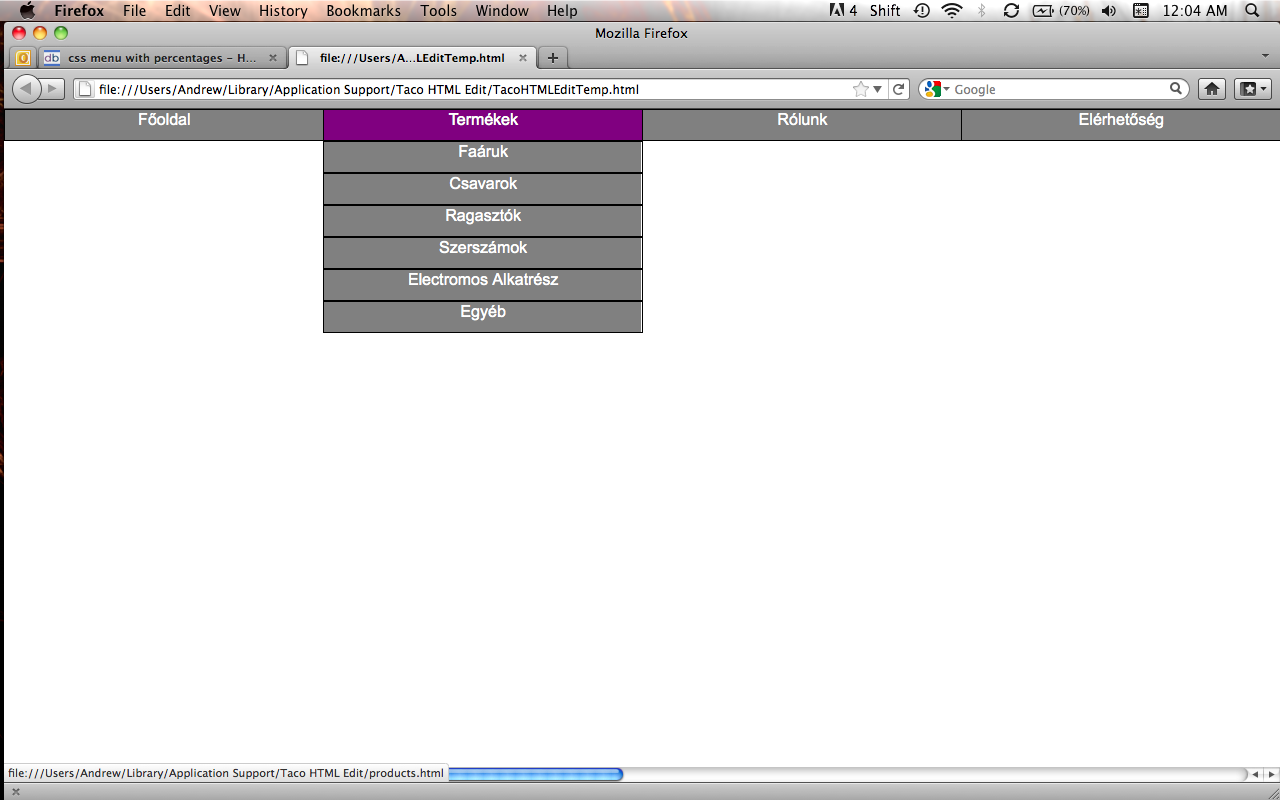
The screen shots display fine for me. Try messing with the z-index for the button, and if that does nothing you could try position the button absolutely. Keep in mind that you should give the containing popup a relative position if you do the latter.

If none of this makes a difference I will have to look into how the scroll is actually being displayed.

Regards,
Arkinder

Arkinder 93 Posting Pro in Training

background: url('images/footer.jpg') no-repeat; Note the single quotes.

Make sure that you're using the correct file path, then try giving it a set width and height. If it's still not appearing, then another element is affecting it.

Regards
Arkinder

Arkinder 93 Posting Pro in Training

It might be possible with psuedo-classes, but you would have to be very careful about where you place each element - more trouble that it's worth.

jQuery is a JavaScript library that allows you to do things like this with very little code - 4-8 lines. So I definitely recommend going with that.

Regards
Arkinder

Arkinder 93 Posting Pro in Training

Give the non-background divisions a higher z-index.

Regards
Arkinder

Arkinder 93 Posting Pro in Training

Sorry, I must have misunderstood you. You're wanting to use several divisions, each with its own background image, to make one background image? That's definitely doable.

Regards
Arkinder

Arkinder 93 Posting Pro in Training

No, you cannot use multiple background images on one element.

Regards
Arkinder

Arkinder 93 Posting Pro in Training

No problem, and Ips is correct. Although clear: left; would be a little more practical since there aren't any elements being floated to the right.

Regards
Arkinder

Arkinder 93 Posting Pro in Training
<!DOCTYPE HTML PUBLIC "-//W3C//DTD HTML 4.01//EN" "http://www.w3.org/TR/html4/strict.dtd">
<html>
<head>
<style type="text/css">

h3 { display: inline;}  /* removes space before and after the heading elements */

.column {
	width: 278px;
	float: left;  /* places divisions on the same line */
}

.space { margin-left: 66px;}

</style>
</head>

<body>
<div>

<h3>Welcome</h3><br>
<div class="column">Ensure you are not spamming, plugging or linking to your product, service or website anywhere within your post.</div>
<div class="column space">Ensure you are not spamming, plugging or linking to your product, service or website anywhere within your post.</div>

</div>
</body>
</html>

Paragraphs and heading elements insert a new line both before, and after, the element. To remove this, use the display property the way I did above.

Regards
Arkinder

Arkinder 93 Posting Pro in Training

Use jQuery.

Regards
Arkinder

Arkinder 93 Posting Pro in Training

I'm seeing the same navigation bar. Have you cleared your browser's cache?

Regards
Arkinder

Arkinder 93 Posting Pro in Training

Okay, the problem is simple. The position: absolute; and left: -999em; are being inherited by each child ul . So on the 3rd drop down you're only setting one left: -999em to auto , out of three.

While I can fix that, it creates a new problem. There just isn't a way to write a CSS selector with a pseudo-class that will work on that third ul . Firefox, Chrome, and Safari are all working correctly. Earlier versions of Safari and any version of Opera round down to the nearest unit when using decimal places (12.8em = 12em - not the actual problem but just in case you weren't aware).

You'll just have to make the navigation another way. Lists really aren't even needed for navigation bars.

Regards
Arkinder

Arkinder 93 Posting Pro in Training

Okay, you're positioning A LOT of elements here. Right now I don't have time to go through the parsing order of them all, but make sure to check the specificity of each rule. I'll take a look at it this again some time after lunch.

Regards
Arkinder

Arkinder 93 Posting Pro in Training

Include the controls parameter.

<div id="video"><embed src="video/hari_ini_sakit.mp4" width="200" height="175" controls="0"></embed></div>

Regards
Arkinder

Arkinder 93 Posting Pro in Training

I can't look at it right now, but try the z-index property.

z-index: -1;

Regards
Arkinder

Arkinder 93 Posting Pro in Training

Awesome, if you run into any more issues just post a new thread.

Regards
Arkinder

Arkinder 93 Posting Pro in Training

hey why dont you use auto margin!
it can bring image at the center of the screen

Because that problem was already solved by the second post in this thread, and was followed by two more questions. Please read threads before posting in them.

Regards
Arkinder

Arkinder 93 Posting Pro in Training

Oh, okay. You had an HTML 4.01 transitional doctype. It may be possible a different way with CSS3 - not sure.

Place the drop down inside of any of the divisions with a class of menu. This will also allow you to have a different drop down for each menu item.

<ul>
<li><div class="menu"><a href="#">Item 1</a><div class="dropdown">Hi</div></div></li>
<li><div class="menu"><a href="#">Item 2</a></div></li>
<li><div class="menu"><a href="#">Item 3</a></div></li>
<li><div class="menu"><a href="#">Item 4</a></div></li>
<li><div class="menu"><a href="#">Item 5</a></div></li>
</ul>

Regards
Arkinder

Arkinder 93 Posting Pro in Training
<footer>

Is not an HTML tag. Try using a division instead.

<div id="footer">
</div>

Then, in your CSS.

#footer {
/* CSS properties */
}

<header> doesn't exist either. Fix those and then we'll work on the drop down menu.

Regards
Arkinder

Arkinder 93 Posting Pro in Training

Yep, I already talked about it. See the edit in this post.

Regards
Arkinder

Arkinder 93 Posting Pro in Training

You're making the navigation 100% of 90% of 90% of the document. Try this.

li > ul li {
    clear: left;
    width: 22.4%;
}

Regards
Arkinder

Arkinder 93 Posting Pro in Training

It's definitely being caused by another CSS rule. Do you have a test site that I could view? If not, post your HTML please.

Make sure to ask yourself the question, "Percentage of what?" It can get a little confusing if you don't keep track of them.

Regards
Arkinder

Arkinder 93 Posting Pro in Training

Okay, something else is affecting it. Post the CSS for the entire page. Also, see if these changes make a difference.

#navMenu ul ul {
	width: 100%;
	visibility: hidden;
	position: absolute;
}
		
#navMenu ul li>ul li {
	width: 25%;
	clear: left;
}

Regards
Arkinder

Arkinder 93 Posting Pro in Training

If you are still using left: 0; remove it, and then you shouldn't need the margin-right. Attached is a screen shot of what I just posted. What is it not doing that you want it to?

EDIT: If you're talking about the small white space on the right of the links, that's just the default background color. Add this to fix it.

#navMenu ul li a {
    width: 100%;
    height: 30px;
    text-align: center; 
    display: block;
    font-family:"Arial", cursive;
    text-decoration: none;
    color: white;
    border: 1px solid black;
    background-color: gray;
}

Regards
Arkinder

Arkinder 93 Posting Pro in Training

Oops, it's percent. There's a little confusion from changing the CSS so much. This is what you should have now that does everything you have asked for so far.

<!DOCTYPE HTML PUBLIC "-//W3C//DTD HTML 4.01//EN" "http://www.w3.org/TR/html4/strict.dtd">
<html>

	<head>
		<title></title>
		<meta http-equiv="Content-Type" content="text/html; charset=utf-8">
		<style type="text/css">

		* { margin: 0; padding: 0;}
		
		#navMenu {
			width: 100%;
		}

		#navMenu ul {
			list-style-type: none;
		}
		
		#navMenu ul li {
			width: 25%;
			background-color: gray;
			float: left;
		}
		
		#navMenu ul ul {
			width: 156%;  /* 16% of 156% is roughly 25% of 100% of the browser window */
			visibility: hidden;
			position: absolute;
		}
		
		#navMenu ul li>ul li {
			width: 16%;  /* 16% is about the highest width the browser will allow before putting elements on the next line - this overwrites the value inherited from the #navMeny ul li rule */
			clear: left;
		}
		
		#navMenu ul li a {
			width: 100%;
			height: 30px;
			text-align: center; 
    		        display: block;
    		        font-family:"Arial", cursive;
    		        text-decoration: none;
    		        color: white;
    		        border: 1px solid black;
		}
		
		#navMenu ul li:hover ul {
			visibility: visible;
		}
		
		/*Change color on hover*/
		#navMenu a:hover {
			background: purple;
		}

		#navMenu li:hover {
			color: white;
			background-color: blue;
		}


		/* hover for link items */
		#navMenu ul li:hover ul li a:hover {
			color: white;
			background-color: red;
		}
		
		.clearFloat {
    		clear:both; 
 		}
		
		</style>
	</head>
	
	<body>
	
	<div id="navMenu">
             <ul> <!-- main ul -->
             	<li><a href="index.html">Főoldal</a></li>
             	<li><a href="products.html">Termékek</a>
             		<ul> 
             			<li><a href="">Faáruk</a></li>	
             			<li><a href="">Csavarok</a></li>	
             			<li><a href="">Ragasztók</a></li>	
             			<li><a href="">Szerszámok</a></li>	
             			<li><a href="">Electromos Alkatrész</a></li>	
             			<li><a href="">Egyéb</a></li>
             		</ul>
             		
             	</li> <!-- end of products -->
             	<li><a …
Arkinder 93 Posting Pro in Training

Which word is Products? :P

#navMenu ul ul {
	width: 156;
	visibility: hidden;
	position: absolute;
}

Regards
Arkinder

Arkinder 93 Posting Pro in Training

Okay, it's not me this time. Your post doesn't make sense at all. So you're wanting them to go straight down?

If so:

#navMenu ul li>ul li {
    width: 16%;
    clear: left;
}

Regards
Arkinders

Arkinder 93 Posting Pro in Training

ROFLMFAO. That's not what you wanted? Geez, I misread your post... again! Wow, just one epic fail after the other. Anyways, use the markup and CSS I just posted with this one addition in green.

#navMenu ul ul {
    position: absolute;
    left: 0;
    visibility: hidden;
    width: 156.4%;
}

Regards
Arkinder

Arkinder 93 Posting Pro in Training

Okay, this isn't possible with position: relative; in there. However, you don't need it. The comments in the CSS explains how this works.

<!DOCTYPE HTML PUBLIC "-//W3C//DTD HTML 4.01//EN" "http://www.w3.org/TR/html4/strict.dtd">
<html>

	<head>
		<title></title>
		<meta http-equiv="Content-Type" content="text/html; charset=utf-8">
		<style type="text/css">

		* { margin: 0; padding: 0;}
		
		#navMenu {
			width: 100%;
		}

		#navMenu ul {
			list-style-type: none;
		}
		
		#navMenu ul li {
			width: 25%;
			background-color: gray;
			float: left;
		}
		
		#navMenu ul ul {
			width: 156.4%;  /* 16% of 156.4% is roughly 25% of 100% of the browser window */
			visibility: hidden;
			position: absolute;
		}
		
		#navMenu ul li>ul li {
			width: 16%;  /* 16% is about the highest width the browser will allow before putting elements on the next line - this overwrites the value inherited from the #navMeny ul li rule */
		}
		
		#navMenu ul li a {
			width: 100%;
			height: 30px;
			text-align: center; 
    		        display: block;
    		        font-family:"Arial", cursive;
    		        text-decoration: none;
    		        color: white;
    		        border: 1px solid black;
		}
		
		#navMenu ul li:hover ul {
			visibility: visible;
		}
		
		/*Change color on hover*/
		#navMenu a:hover {
			background: purple;
		}

		#navMenu li:hover {
			color: white;
			background-color: blue;
		}


		/* hover for link items */
		#navMenu ul li:hover ul li a:hover {
			color: white;
			background-color: red;
		}
		
		.clearFloat {
    		clear:both; 
 		}
		
		</style>
	</head>
	
	<body>
	
	<div id="navMenu">
             <ul> <!-- main ul -->
             	<li><a href="index.html">Főoldal</a></li>
             	<li><a href="products.html">Termékek</a>
             		<ul> 
             			<li><a href="">Faáruk</a></li>	
             			<li><a href="">Csavarok</a></li>	
             			<li><a href="">Ragasztók</a></li>	
             			<li><a href="">Szerszámok</a></li>	
             			<li><a href="">Electromos Alkatrész</a></li>	
             			<li><a href="">Egyéb</a></li>
             		</ul>
             		
             	</li> <!-- end of products -->
             	<li><a href="about.html">Rólunk</a></li> <!-- end of about -->
             	<li><a href="about.html">Elérhetőség</a></li> …
Arkinder 93 Posting Pro in Training

Exactly, it's called a fluid layout. But as you can it has it's fair share of issues. I just made an incredibly strong cup of French Roast. ^_^ So, I'll take another look and get back to you in a few minutes.

Regards
Arkinder

Arkinder 93 Posting Pro in Training

Once again, my apologies. Not my greatest week. The position: relative; here is causing the issue.

#navMenu li {
    background-color: gray;
    float: left;
    list-style: none outside none;
    margin: 0;
    padding: 0;
    position: relative;
}

You could try removing it and using a width with an em unit. I'm just out of creative, or any for that matter, solutions right now. If I think of anything I'll let you know.

Regards
Arkinder

Arkinder 93 Posting Pro in Training

Which browser is this happening in? It displays fine in my Firefox 5.

Regards
Arkinder

Arkinder 93 Posting Pro in Training

Yeah, if it were bigger then it wouldn't have to stretch on larger screen resolutions. The solution I provided causes it to be 100% on 1341x768 and down, but the image just isn't large enough to compensate for anything larger without stretching.

Regards
Arkinder

Arkinder 93 Posting Pro in Training

Oh, lol. For the margin: auto; to work just give the absolutely positioned element a left and right value.

#Images img {
	display: block;
	position: absolute;
	max-width: 100%;
	height: 100%;
	margin: auto;
	left: 0;
	right: 0;
}

top, bottom, left, and right are the margin equivalent for absolutely positioned elements. Basically, the default values are nothing, where the default for margin is 0. If that makes sense.

Regards
Arkinder

ptemedia commented: Will succeed and find a working solution!!! +2
Arkinder 93 Posting Pro in Training

I don't really understand what it is you're trying to do. You're using position: absolute; which removes the images from the normal flow of the page, which will cause them to stack on top of each other. You're also using margin: 0 auto; with display: block; So I can only assume that you're trying to center the images within their containing element. To do this, make these changes. Removed properties in red. Changed/New properties in green.

#Images {
    position:relative;
    text-align: center;
    height: 100%;
    max-width: 100%; <!-- 100px -->
    margin: auto;
}
#Images img {
    display: block;
    position: absolute;
    max-width: 100%;
    height: 100%;
    margin: auto;
}

If this is not what you're going for, then please be more specific.

Regards
Arkinder

Arkinder 93 Posting Pro in Training

You have to have a set height with a px or em unit. Otherwise you're saying height: 70%; should be 70% of nothing, which equals nothing.

Just throw it in a body selector.

body { width: 100%; height: /* xem/xpx */;}

Regards
Arkinder

Arkinder 93 Posting Pro in Training

its stretching the background image when you resize your browser.

Well yeah. What else is it supposed to do when the original image is only 1341x768?

Regards
Arkinder

Arkinder 93 Posting Pro in Training

Good! Well, that's pretty simple, and you don't have to change much.

<div id="wrapper">
	
		<div class="box">
		</div>
		<div class="box alternate_color">
		</div>
		<div class="box">
		</div>
		<div class="box alternate_color">
		</div>

		<div class="alternate_color box">
		</div>
		<div class="box">
		</div>
		<div class="alternate_color box">
		</div>
		<div class="box">
		</div>

		<div class="box">
		</div>
		<div class="box alternate_color">
		</div>
		<div class="box">
		</div>
		<div class="box alternate_color">
		</div>

		<div class="alternate_color box">
		</div>
		<div class="box">
		</div>
		<div class="alternate_color box">
		</div>
		<div class="box">
		</div>
	
	</div>

This only works while the .alternate_color selector comes after the .box selector in your CSS.

Regards
Arkinder

Arkinder 93 Posting Pro in Training

Hi Toby,

A class is more appropriate because it saves you time, and makes your CSS a lot easier to read. You're using the same CSS for each box, and the entire idea of an ID is that the element is unique. How you should have done this:

<!DOCTYPE HTML PUBLIC "-//W3C//DTD HTML 4.01//EN" "http://www.w3.org/TR/html4/strict.dtd">
<html>

	<head>
		<title></title>
		<meta http-equiv="Content-Type" content="text/html; charset=utf-8">
		<style type="text/css">
		
		* { margin: 0; padding: 0;}
		
		#wrapper {
			width: 520px;
			height: 520px;
			background: #ffffff;
			border: 1px solid #600;
		}
		
		.box {
			width: 130px;
			height: 130px;
			background-color: #46311C;
			float:left;
		}
		
		.alternate_color {
			background-color: #968E88;
		}
		
		</style>
	</head>
	
	<body>
	<div id="wrapper">
	
		<div class="box">
		</div>
		<div class="box alternate_color">
		</div>
		<div class="box">
		</div>
		<div class="box alternate_color">
		</div>
		<div class="box">
		</div>
		<div class="box alternate_color">
		</div>
		<div class="box">
		</div>
		<div class="box alternate_color">
		</div>
		<div class="box">
		</div>
		<div class="box alternate_color">
		</div>
		<div class="box">
		</div>
		<div class="box alternate_color">
		</div>
		<div class="box">
		</div>
		<div class="box alternate_color">
		</div>
		<div class="box">
		</div>
		<div class="box alternate_color">
		</div>
	
	</div>
	</body>
	
</html>

So now instead of having to change every CSS rule, you will only have to change two. As for making the layout fluid, it was to show you that height doesn't always play well with percentages. Just don't worry about it for now.

Regards
Arinder

Arkinder 93 Posting Pro in Training

Sorry, I really should look at it before saying anything. Try this:

img.bg {
    display: block;
    left: 0;
    min-height: 100%;
    min-width: 100%;
    position: fixed;
    top: 0;
    width: 100%;
}

Regards
Arkinder

Arkinder 93 Posting Pro in Training

Alright, so if you really want to learn the language. You have to use it. So by just giving you the markup and CSS you wouldn't actually gain much. So instead, I'm going to walk you step by step through the thought process, and then help you with markup and CSS.

Doing this with a table is pretty easy, and it's not really tabular data, so let's avoid that. This leaves you with the option of lists or divisions. It really doesn't matter, but for the sake of simplicity, use divisions.

I am looking to create a grid/table for a shopping cart page

Okay, so make this page. You currently don't have content so you would think that it's supposed to be blank. However, you should always start with a basic exoskeleton - so to speak. This is important because your starting with a valid page, and you won't have to worry about adding any of it later.

<!DOCTYPE HTML PUBLIC "-//W3C//DTD HTML 4.01//EN" "http://www.w3.org/TR/html4/strict.dtd">
<html>

	<head>
		<title></title>
		<meta http-equiv="Content-Type" content="text/html; charset=utf-8">
	</head>
	
	<body>
	</body>
	
</html>

inside the main content container

So in the page simply add a division and give it an ID. Call it container, content, wrapper, or whatever. Just make sure that its purpose is clear.

I want the overall grid to be a width of 520px and have a height of 520px

The basis of the grid will be the container division, so your CSS would look something like this:

Arkinder 93 Posting Pro in Training

Yes, try this.

.sf_navigation {
    clear:both;
    margin: 0 auto;
    padding:0;
    width: 95%;
}

Regards
Arkinder

Arkinder 93 Posting Pro in Training

Hi mundee,

Welcome to Daniweb! To start, you need a good foundation in HTML and CSS. I recommend the following tutorials: HTML Dog, Mozilla, Google, and of course anything that the W3C has to say.

Unfortunately without seeing the markup from the template I can't give you an exact answer. However, a widely used technique for centering elements is by giving the margin property a value of 0 auto . For example:

<!DOCTYPE HTML PUBLIC "-//W3C//DTD HTML 4.01//EN" "http://www.w3.org/TR/html4/strict.dtd">
<html>

	<head>
		<title></title>
		<meta http-equiv="Content-Type" content="text/html; charset=utf-8">
		<style type="text/css">
		
		#whatever { 
			width: 70%;
			margin: 0 auto;
		}
		
		</style>
	</head>
	
	<body>
	
	<div id="whatever">
	Lorem ipsum dolor sit amet, consectetur adipisicing elit, sed do eiusmod tempor incididunt ut labore et dolore magna aliqua. Ut enim ad minim veniam, quis nostrud exercitation ullamco laboris nisi ut aliquip ex ea commodo consequat. Duis aute irure dolor in reprehenderit in voluptate velit esse cillum dolore eu fugiat nulla pariatur. Excepteur sint occaecat cupidatat non proident, sunt in culpa qui officia deserunt mollit anim id est laborum.
	</div>
	
	</body>
	
</html>

If you need a better explanation or help with something, feel free to ask.

Regards
Arkinder

Arkinder 93 Posting Pro in Training

Since you're able to use position: fixed; with this page you could probably just remove the min-height .

Regards
Arkinder

Arkinder 93 Posting Pro in Training

It should be. Align is a deprecated attribute - don't use it. Just try displaying it as a normal image first

<img alt="" src="Images/header.gif">

Are you locally hosting this or is it on a site?

Regards
Arkinder

Arkinder 93 Posting Pro in Training

The correct syntax for the background property is: background: url('Images/header.gif') no-repeat; Also, file paths are case-sensitive.

So you have a folder named Images in the same folder as the HTML/CSS document with this CSS rule?

Regards
Arkinder

Arkinder 93 Posting Pro in Training

.floatleftbox is being floated left, which removes it from the normal flow of the page. Also, it's pointless to have display: inline; and float: left; . The float will be the only one taken into account.

The reason this is happening is because of margin: 100px auto; The browser is just compensating. If you remove the float: left; and display: inline; it should display correctly.

Regards
Arkinder

Arkinder 93 Posting Pro in Training

This is not possible with HTML or CSS. You would need a server-side language like PHP.

Regards
Arkinder

Arkinder 93 Posting Pro in Training

Oh,

Remove this:

img.bg {
  left: 50%;
  margin-left: -512px;
}

And change min-width: 1024px; to 101em. I suggest using the em unit for min-height too.

img.bg {
  min-height: 74em;
  min-width: 101em;
  width: 100%;
  height: 100%;
  position: absolute;
  top: 0pt;
  left: 0pt;
}

Regards
Arkinder

Arkinder 93 Posting Pro in Training

He means use em or % for everything. Keep in mind that the actual value outputted by the em unit is based on font size.

An example for the % unit.

div#container {
    border-color: white white -moz-use-text-color;
    border-style: solid solid none;
    border-width: 10px 10px 0;
    margin-left: auto;
    margin-right: auto;
    overflow: auto;
    width: 69%; /* Instead of the 800px you were using */
}

Regards
Arkinder

AngelicOne commented: very helpful +3
Arkinder 93 Posting Pro in Training

To add to what almostbob has said.

The doctype is the set of rules you are telling the browser you are using to create the page. Change the doctype, change the rules. - doc

Regards
Arkinder