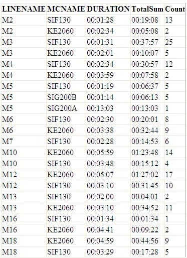
I have datatable looks like below:
I want to create a stack chart that will produce something like this:
I don't know where to start. I have google about how to create stack column but still can't get it.
So far I have a chart but mcname not include (only have LINENAME at X-Axis, DURATION at Y-Axis and Count (As Frequency) at Secondary Y-Axis)
This is my chart code:
' Setup the chart
            With Chart1
                .DataSource = grpTot ''Datatable name
                .Legends.Clear()
                .ChartAreas.Clear()
                .BackColor = Drawing.Color.Linen

                .ChartAreas.Add(New ChartArea("Fred"))

                With .ChartAreas("Fred")
                    .AxisY.LabelStyle.Format = "HH:mm:ss"
                    .AxisY.Minimum = DateTime.FromOADate( _
                    Math.Floor(CDate(grpTot.Compute("min([ChartTime])", "True")).ToOADate)) _
                   .ToOADate

                    'Play with this to get the effect you want
                    .AxisX.LabelStyle.Interval = 1
                    .AxisX.LabelStyle.Format = "G"
                    .AxisX.LabelStyle.IntervalType = DateTimeIntervalType.Auto
                    .AxisX.Title = "LINE"
                    .AxisY.Title = "AVERAGE LOST TIME (hh:mm:ss)"
                    .AxisY2.Title = "FREQUENCY"
                    .AxisX.TitleFont = New Drawing.Font("arial", 12)
                    .AxisY.TitleFont = New Drawing.Font("arial", 12)
                    .AxisY2.TitleFont = New Drawing.Font("arial", 12)
                    .AxisX.MajorGrid.Enabled = False
                    .AxisY.MajorGrid.Enabled = False


                End With

                .Series.Clear()
                .Series.Add(New Series("AVERAGE LOST TIME"))

                With .Series("AVERAGE LOST TIME")
                    .ChartArea = "Fred"
                    .ChartType = SeriesChartType.Column
                    .XValueType = ChartValueType.String
                    .XValueMember = "Linename"
                    .YValueType = ChartValueType.DateTime
                    .YValueMembers = "ChartTime"
                    .Color = Drawing.Color.DeepSkyBlue

                End With

                .Series.Add(New Series("FREQUENCY"))


                With .Series("FREQUENCY")
                    .ChartArea = "Fred"
                    .ChartType = SeriesChartType.Line
                    .BorderWidth = 2
                    .BorderColor = Drawing.Color.DarkOrange
                    .XValueType = ChartValueType.String
                    .XValueMember = "Linename"
                    .YValueType = ChartValueType.Int64
                    .YValueMembers = "Count"
                    .Color = Drawing.Color.DarkMagenta
                    .YAxisType = System.Web.UI.DataVisualization.Charting.AxisType.Secondary

                End With

            End With
Can someone help me please..


