Sir I have these codes in <head> section

<meta name="viewport" content="width=device-width, initial-scale=1"> <style type="text/css">
#small_box_r
{
float:left;
width:31.1%;
border:1px solid #ccc;
border-radius:6px;  
padding:0px 0px 0px 0px;
margin:15px 5px 15px 5px;
height:300px;
color:#39F;
font-weight:bold;
text-align:center;
overflow:auto;
background-size:cover;
}

@media (min-width: 400px) and (max-width: 800px){
  #small_box_r {
       min-width: 100%;
           max-width: 100%;
       }
}
</style>

On Computer, small_box_r div look like as follows
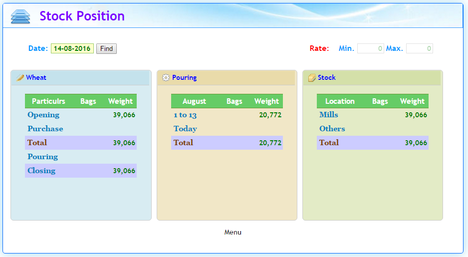
aa.png

But ...

On mobile screen,small_box_r div look like as follows
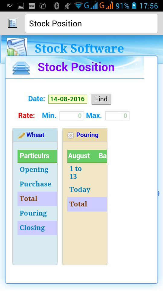
bb.jpg

About half of the div is not visible.

Please help me what I doing wrong and how to display small_box_r div fully visible on mobile?

Thanks

I usually specify only the max-width for my media queries under 767px (mobile). For smaller desktop screens I set a min-width and max-width. Youre screen is probably smaller than 400px wide and therefore not accepting your styles specified in the media query.

For reference, here are some vertical screen widths of iPhones:
320px = iphone4 + iphone5
375px = iphone 6
414px = iphone 6+

Let me know if only setting a max-width solves your issue. Good luck!

// DESKTOP RESPONSIVE DECLARATIONS
@media (min-width: 992px) and (max-width: 1199px) {

}
@media (min-width: 768px) and (max-width: 991px) {

}

// MOBILE RESPONSIVE DECLARATIONS
@media (max-width: 767px) {

}
@media (max-width: 667px) {

}
@media (max-width: 543px) {

}
@media (max-width: 414px) {

}
@media (max-width: 375px) {

}
@media (max-width: 320px) {

}

The css in your MQ should look something like this

@media (min-width: 400px) and (max-width: 800px){
    #small_box_r {
        float: none;
        width: auto;
    }
}
Be a part of the DaniWeb community

We're a friendly, industry-focused community of developers, IT pros, digital marketers, and technology enthusiasts meeting, networking, learning, and sharing knowledge.