Member Avatar for tobeeornot

Hi,

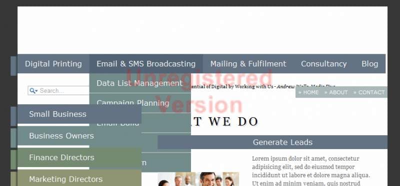
I am having some problems with my navigation bar (see attached file), and am hoping for some suggestions to fix.

Problems are:

1. I am unable to stretch the padding across the top of the horizontal nav bar so it reaches the end. If I change the padding by even a pixel the last heading (blog) drops to the next line.
2. The drop-down menu appears to go underneath some of the following elements and I am not sure why or how to fix.

Any feedback would be great.

The drop down is based on the code provided by CSS-tricks: http://css-tricks.com/2282-simple-jquery-dropdowns/

Member Avatar for tobeeornot

c'mon guys. a little help please.

It is all about css positioning. Even you did not change the pixel but zoom the browser will take the effect also. Try to change the position to absolute and style everything accordingly. It should work fine then.

Member Avatar for tobeeornot

Thanks for replying IPS but I am not quite following you?

What about you try to put your code here and I see if I can dig into it with you? If it is really private, and you believe in me, you can probably email me with it at lauodd@gmail.com

Member Avatar for tobeeornot

Hi there,

Many thanks for the offer.

There is nothing private about the code so if you can have a look that would be most appreciated.

If you go to the following link, there is a mock-up version with the relevant code which you can edit: http://jsfiddle.net/tobeeornot/7q6J2/

Alternatively, I have listed the relevant code below:

<!DOCTYPE html>
<html>

<head>
    <meta charset='UTF-8' />
    
    <title>Media Five</title>
    
    <link rel='stylesheet' href='css/style.css' />
    <link rel="stylesheet" type="text/css" href="css/nav.css">
    <!--[if lte IE 7]>
        <link rel="stylesheet" type="text/css" href="css/ie.css" media="screen" />
    <![endif]-->
<script type="text/javascript" src="js/jquery-1.3.1.min.js"></script>    
    <script type="text/javascript" language="javascript" src="js/jquery.dropdownPlain.js"></script>
</head>            

<body>

    <div id="wrapper" class="group">
        
        <header>
            <a href="#" id="home-link">Home</a>
    
                <!--<p>01923225369
    
                enquires@mediafive.com</p>-->
                
                 <nav id="main-navigation">
        <ul class="dropdown">
            <li><a href="#">Digital Printing<span></span></a>
                <ul class="sub_menu">
                     <li><a href="#">Bureau Services</a></li>
                     <li><a href="#">Variable Data</a></li>
                     <li><a href="#">Communication Devices</a></li>
                     <li><a href="#">Karge Format</a></li>
                </ul>
            </li>
            <li><a href="#">Email & SMS Broadcasting</a>
                <ul class="sub_menu">
                    <li><a href="#">Data List Management</a></li>
                    <li><a href="#">Campaign Planning</a></li>
                     <li><a href="#">Email Build</a></li>
                     <li><a href="#">Broadcast</a></li>
                     <li><a href="#">Track & learn</a></li>
                </ul>
            </li>
            <li><a href="#">Mailing & Fulfilment</a>
                <ul class="sub_menu">
                     <li><a href="#">Direct Mail</a></li>
                    <li><a href="#">Fulfilment</a></li>
                     <li><a href="#">Postal Services</a></li>
                </ul>
            </li>
            <li><a href="#">Consultancy</a>
                <ul class="sub_menu">
                     <li><a href="#">Print Management</a></li>
                     <li><a href="#">Cross Media Services</a></li>
                     <li><a href="#">Stragety Execution</a></li>
                </ul>
            </li>
            <li><a href="#">Blog</a></li>
        </ul>
       </nav>
                    
                 <p><a href="#" title="Home Page" class="breadcrumb">&raquo; Home</a><a href="#" title="About Page" class="breadcrumb">&raquo; About</a></a><a href="#" title="Contact Page" class="breadcrumb">&raquo; Contact</a></p>
        
        </header>
    
        <div id="main-content">


            <blockquote id="main-quote">
            Realise the Potential of Digital by Working with Us
            <cite>- Andrew Wells, Media Five</cite>
            </blockquote>
            
            <h2>What We Do</h2>
            
            <ul id="we-do">
                <li>
                    <h3>Generate Leads</h3>
                    <p>Lorem ipsum dolor sit amet, consectetur adipisicing elit, sed do eiusmod tempor incididunt ut labore et dolore magna aliqua. Ut enim ad minim veniam, quis nostrud exercitation ullamco laboris nisi ut aliquip ex ea commodo consequat. Duis aute irure dolor in reprehenderit in voluptate velit esse cillum dolore eu fugiat nulla pariatur. Excepteur sint occaecat cupidatat non proident, sunt in culpa qui officia deserunt mollit anim id est laborum.</p>
                    <img src="images/leads.jpg" width="176" height="58" alt="leads">
                    <a href="#" class="button">View More</a>
                </li>
                <li>
                    <h3>Improve Sales</h3>
                    <p>Lorem ipsum dolor sit amet, consectetur adipisicing elit, sed do eiusmod tempor incididunt ut labore et dolore magna aliqua. Ut enim ad minim veniam, quis nostrud exercitation ullamco laboris nisi ut aliquip ex ea commodo consequat. Duis aute irure dolor in reprehenderit in voluptate velit esse cillum dolore eu fugiat nulla pariatur. Excepteur sint occaecat cupidatat non proident, sunt in culpa qui officia deserunt mollit anim id est laborum.</p>
                    <img src="images/sales.jpg" width="176" height="58" alt="sales">
                    <a href="#" class="button">View More</a>
                </li>
                <li>
                    <h3>Retain your Customers</h3>
                    <p>Lorem ipsum dolor sit amet, consectetur adipisicing elit, sed do eiusmod tempor incididunt ut labore et dolore magna aliqua. Ut enim ad minim veniam, quis nostrud exercitation ullamco laboris nisi ut aliquip ex ea commodo consequat. Duis aute irure dolor in reprehenderit in voluptate velit esse cillum dolore eu fugiat nulla pariatur. Excepteur sint occaecat cupidatat non proident, sunt in culpa qui officia deserunt mollit anim id est laborum.</p>
                    <img src="images/customers.jpg" width="176" height="58" alt="customers">
                    <a href="#" class="button">View More</a>
                </li>
             </ul>
            </div><!--END main content-->
        
        <aside>
        
        <form action="#" id="searchform" method="get">
                <div>
                    <label for="s" class="screen-reader-text"></label>
                    <input type=search results=5 placeholder=Search... id=s name=s>

                </div>
            </form>
            
            <nav id="sub-navigation">
                <ul>
                    <li><a href="#">Small Business<span></span></a></li>
                    <li><a href="#">Business Owners<span></span></a></li>
                    <li><a href="#">Finance Directors<span></span></a></li>
                    <li><a href="#">Marketing Directors<span></span></a></li>
                    <li><a href="#">Sales Directors<span></span></a></li>
                    <li><a href="#">Advertising Agencies<span></span></a></li>
                </ul>
            </nav>


        </aside>
        
        
    </div><!--END wrapper-->
    
    <footer>
        <div id="copyright">&copy;2011 Media Five</div>
        <div id="footer-menu">
        <a href="#">Privacy Policy</a> | 
        <a href="#">Terms of Use</a> | 
        <a href="#">Our Values</a>  
        </div><!--END footer-menu-->
    </footer>

</body>

</html>
* { 
    margin: 0; 
    padding: 0; 
}

html {
    background:black url(../images/bg.jpg);
} 
body { 
    font: normal 62.5%/1.4  Georgia, "Times New Roman", Times, serif;
} 

/*CLEAR-FIX HACK*/
.group:after {
        visibility: hidden;
        display: block;
        content: "";
        clear: both;
        height: 0;
}

.group {
    display:inline-block;
    clear:both;
}
 html .group{height: 1%;}
.group {display:block} 
/*CLEAR-FIX HACK END*/
/*need to apply class .group to "wrapper"*/

article, aside, figure, footer, header, nav, section { 
    display: block; 
} 

.button { 
    background-image: -moz-linear-gradient(top, #6b7886, #3b4f63); 
    background-image: -webkit-gradient(linear,left top,left bottom,color-stop(0, #6b7886),color-stop(1, #3b4f63)); 
    padding: 5px 15px; 
    color: white; 
    font-size: 1.2em;
    font-weight: normal !important;
    text-decoration: none; 
    text-transform: uppercase; 
    border: 2px solid white !important; 
    -moz-box-shadow: 1px 1px 3px #666; 
    -webkit-box-shadow: 1px 1px 3px #666; 
    box-shadow: 1px 1px 3px #666;
}
.button:hover { 
    background-image: none; 
    background-color: #6b7886; 
    -moz-box-shadow: 0px 0px 2px #999; 
    -webkit-box-shadow: 0px 0px 2px #999; 
    box-shadow: 0px 0px 2px #999; 
    text-decoration: none !important; 
}


#wrapper {
    width:800px;
    margin:30px auto 10px;
    background: white;
}

header {     position: relative;
    margin: 0;
    padding: 0;
    height: 100%;
    background: url(../images/logo.png) no-repeat left top;
    width: 800px;
    height: 102px;
}


header p {
    position: absolute;
    font-size: 1.4em;
    text-transform:uppercase;
    left: 550px;
    top: 50px;
    display: block;
}

h2 {
    color: #000;
    text-transform: uppercase;
    text-shadow: 2px 2px 0 #d8d8dc; 
    font-weight: normal;
    font-size: 2.6em;
    margin: 50px 0 12px 0;
    letter-spacing: 5px;
}

#home-link {
    position:absolute;
    width: 314px; 
    height: 110px;  
    text-indent: -9999px; 
}

/*main-navigation*/
ul.dropdown { 
    position: relative;
    top: 103px; 
    font: 16px Verdana, Geneva, sans-serif;
    list-style: none;     
}
ul.dropdown li span {
     position: absolute;
    left: -15px;  
    top: 5px;
    width: 15px;
    height: 100%;
    background-color: #647484; /*default color for links*/
    background-image: url(../images/navshadow.png); /*shadow effect for background nubs*/
    background-position: right top; 
    background-repeat: repeat-y; /*y - vertically positioned*/
}

ul.dropdown li { 
    font-weight: normal; 
    float: left; 
    zoom: 1; 
    background: #647484; /*main nav bg color*/
    padding: 12px 16px;
        position: relative;
}

ul.dropdown a:hover    {
     color: #000;      
}

ul.dropdown a:active { 
    color: #ffa500; 
     
}

ul.dropdown li a { 
    display: block; 
       color: white;  
    text-decoration: none;      
}

ul.dropdown li:last-child a { 
    border-right: none; 
}  
ul.dropdown li.hover,
ul.dropdown li:hover { 
    background: #526476;     color: black; 
    position: relative; 
}

ul.dropdown li.hover a{ 
    color: white;  }


/* 
    LEVEL TWO
*/
ul.dropdown ul { 
    width: 220px;      
    visibility: hidden; 
    position: absolute; 
    top: 100%; 
    left: 0;
    list-style: none;
}

ul.dropdown ul li { 
    font-weight: normal; 
    background: #728c8c; /*bg color of menu*/
    color: #000; 
    border-bottom: 1px solid #ccc; /*bottom border color on drop menu*/
    float: none; 
}
                                      
/* IE 6 & 7 Needs Inline Block */
ul.dropdown ul li a    { 
    border-right: none; 
    width: 100%; 
    display: inline-block; 
} 

/* 
    LEVEL THREE
*/
ul.dropdown ul ul{ 
    left: 100%; 
    top: 0; 
}
ul.dropdown li:hover > ul { 
    visibility: visible; 
}


/*sub-navigation*/
#sub-navigation {
  margin: 0 0 30px 0;
}

#sub-navigation ul {
    list-style: none; /*gets rid of bullets*/
}

#sub-navigation ul li a {
    display: block; /*anchor linkls are by default inline*/
    background-color: #647484; /*default color for links*/
    color: white;
    font-family:Verdana, Geneva, sans-serif;
    font-size: 1.6em;
    padding: 10px 10px 10px 25px;
    position: relative;
    text-decoration:none; /*anchor links are underline by default'none' gets rid of this */
    margin: 0 0 5px 0; 
    width: 233px; 
}

 #sub-navigation ul li span {
    position:absolute;
    right: 100%;  
    top: 5px;
    width: 15px;
    height: 100%;
    background-color: #647484; /*default color for links*/
    background-image: url(../images/navshadow.png); /*shadow effect for background nubs*/
    background-position: right top; 
    background-repeat: repeat-y; /*y - vertically positioned*/
}

 
#sub-navigation ul li:nth-child(2) a, #sub-navigation ul li:nth-child(2) a span {
    background-color: #728c8c;
}

#sub-navigation ul li:nth-child(3) a, #sub-navigation ul li:nth-child(3) a span {
    background-color: #768c72;
}
     
#sub-navigation ul li:nth-child(4) a, #sub-navigation ul li:nth-child(4) a span {
    background-color: #909673;
}

#sub-navigation ul li:nth-child(5) a, #sub-navigation ul li:nth-child(5) a span {
    background-color: #647484;
}

#sub-navigation ul li:nth-child(6) a, #sub-navigation ul li:nth-child(6) a span {
    background-color: #728c8c;
}

.breadcrumb {
    padding: 6px;
    width:  50px;
    background: #aababa;
    font: normal 0.8em Verdana, Geneva, sans-serif;
    position: relative;
    top: 125px;
    left: 51px;
}

a.breadcrumb {
    color: white;
    text-decoration:none;
}

a.breadcrumb:hover {
    color: #ad7601;
    text-decoration: none;
}


#main-content {
    float:right;
    width: 467px;
    padding: 65px 30px 0 0;
}
#we-do {
    list-style: none;
}

#we-do li {
    position: relative;
    margin: 0px -30px 20px 0;
}

#we-do li h3 {
    background: #647484;
    color: white;
    font: 1.6em Verdana, Geneva, sans-serif;
    padding: 6px;
    text-indent: 200px;
}

#we-do li p {
    font-size: 1.2em;
    padding: 0 0 0 204px;
    color: #666;
    line-height: 1.5;
    margin: 12px 25px 12px 0;
}

#we-do li img {
    position: absolute;
    top: 80px;
    left: 0;
}

#we-do li .button {
    position: absolute;
    top: 160px;
    left: 32px;
}

aside {
    float: left;
    width: 275px;
    padding: 70px 0 0 0; /*pushes sub-nav down 70px*/
}

#searchform #s {
     width: 188px; 
     margin: 0 0 20px 22px; 
}

#main-quote {
    background: url(../images/mainquote.png) no-repeat;
    width: 475px;
    height: 185px;
    text-indent: -9999px;
    margin: 55px 0 20px 22px;
}

.widget {      background:url(../images/widget-shadow.png) top right no-repeat;
    padding: 30px 30px 20px 30px;  
}

.widget h4 { /*Latest Post*/
    color: #000;
    text-align: right;
    font-size: 1.6em;
    text-shadow: 2px 2px 0 #d8d8dc;
    text-transform: uppercase;
    margin: 0 0 12px 0;
    letter-spacing: 5px; /*spreads the text out*/
    font-weight: normal;
}


.widget .date {
    background:#909673;
    color: #ffecc5;    
    padding: 3px;
    text-align: right;
    width: 235px; /*padding places the bar 30px over from padding above so to stretch it out we increase the width to 235px*/
    margin: 0 0 12px -30px;    /* -30px left pushes the bar over the side, therby overriding the padding style above*/
    letter-spacing: 3px;
    font-sixe: 1.2em;
    text-transform:uppercase;
}

.widget h5 {
    font-weight: normal;
    font-size: 1.8em;
    margin: 0 0 6px 0;
}

.widget p {
    color: #999;
    font-size: 1.2em;
    margin-bottom: 10px;    
} 

.widget .sidebar-post {
  margin: 0 0 30px 0;
}

.latest-news h4 {
  color: #AD7601;
}
.latest-news .date {
  background: #AD7601;
}

footer {
    width: 800px; /*same as wrapper*/
    margin: 0 auto 20px;
    color: white;
    text-transform:uppercase;
    letter-spacing: 3px;
}

#footer-menu {
    width: 47.5%; /*container half the page*/
    float: right; 
}

#footer-menu a{
    color: white;
    text-decoration: none;
}

#footer-menu a:hover{
    text-decoration: underline;
}


#copyright {
    width: 40%; /*container half the page*/
    float: left;
    text-align: left;
}

Err~~ok, I got your problem. You mean that when the resolution is over the width of the browser, the menu will drop to another line. That's mainly because you did not set a fixed width to the body tag. If you really do not wish to set a predefined value to the body, you should probably set it using the javascript which will detect the suitable resolution such as:

el = document.getElementById('pageBody');
el.style.width= screen.width;

You should set an id to your body if you wish to use this code.

Member Avatar for tobeeornot

Hi,

Thanks for your help.

The wrapper is set to a fixed width which is the way it is supposed to be, I think. Changing the body to a fixed width will distort the page.

Member Avatar for tobeeornot

Problem is solved - thanks to the efforts of Chris Burton on CSS-tricks.


1. ul.dropdown li:last-child {padding-right: 20px;} stretches the padding on the last header to the right to cover gap

2. adding z-index: 1; to ul.dropdown li

Thanks again Chris.

Be a part of the DaniWeb community

We're a friendly, industry-focused community of developers, IT pros, digital marketers, and technology enthusiasts meeting, networking, learning, and sharing knowledge.