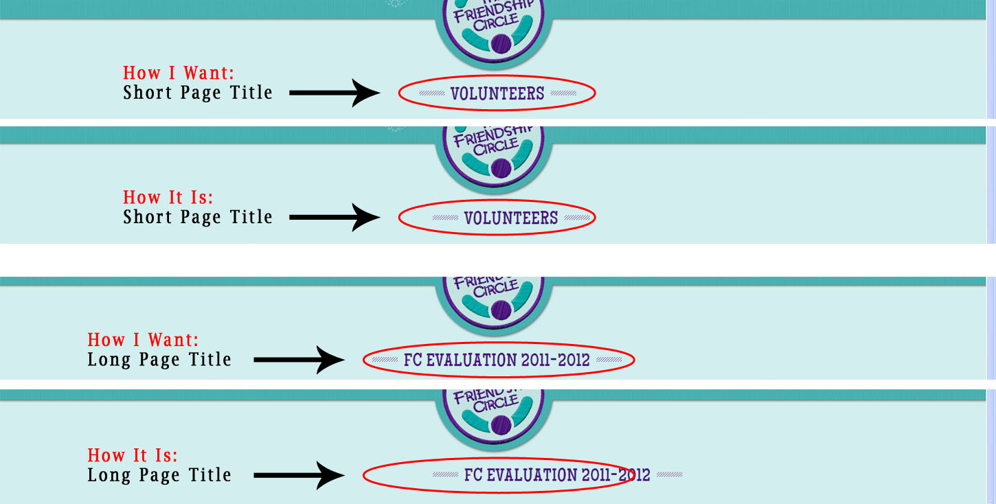
I'm trying to finish the last tweaks on a site I created using an Elegant Themes Wordpress theme and I'm having a frustrating time figuring out how to center the page titles so they are each exactly centered regardless of their width. Here's an image of how I want it to look and how it currently looks, for both short and long titles.
Obviously the width of the title on each page is slightly different which is why I'm having trouble since using margin-left to center the title will need a different margin for eac title and I need something that will be relative and not need to be specified for each title seperately.
Here's the code for the title area of a Short Title:
<div id="category-name">
<div class="title-area">
<div class="left-dash"> </div>
<h1 class="category-title">Volunteers</h1>
<div class="right-dash"> </div>
</div>
</div>
Here's the code for the title area of a Short Title:
<div id="category-name">
<div class="title-area"><div class="left-dash"> </div><h1 class="category-title">FC Evaluation 2011-2012</h1><div class="right-dash"> </div></div>
</div>
Here is the css:
#category-name {
    padding: 0 0 0 16px;
    text-align: center;
}

.title-area {
    margin-left: 362px;
    width: 491px;
}

.left-dash, .right-dash {
    background: url("images/dashed_line.png") repeat-x scroll 50% 50% transparent;
    float: left;
    margin-top: 147px;
    width: 43px;
}

#page-top h1.category-title {
    color: #520E7D;
    float: left;
    font-family: 'MaidenOrangeRegular',sans-serif;
    font-size: 31px;
    font-style: normal;
    letter-spacing: 1px;
    line-height: 80px;
    margin-top: 117px;
    padding: 0 10px;
    text-shadow: 0 0 1px #7AABA5;
    text-transform: uppercase;
}
I know I need to remove the margin-left but I'm not sure what to replace it with to get it to work.
Please help!
Thanks in advance :-)
