roryt 150 Nearly a Posting Virtuoso

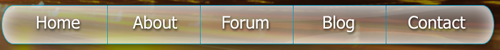
This piece of css will show you that it is perfectly possibly to create a good looking navigation bar without any images or javascript and just a couple of lines of css.

All you need to do is create a html file that contains a unordered list in it with your navigation links in it as <li>. You will then need to simply attach the css file to your html.

I hope this will help you to realise that it isn't all about huge flash navigation and rollover images.

You can find my example here.

roryt 150 Nearly a Posting Virtuoso

I will ignore. But Ancient dragon, the thread is two years old but the rep came through - Mar 17th, 2009 5:51 pm.

Just thought i'd point this out, incase you'd overlooked it. Thanks

crunchie commented: This will make up for the Dude :) +26
roryt 150 Nearly a Posting Virtuoso

If by thumbnails you mean movie specific thumbnails then:

I know you said you have tried everything else but... well this may be a completely pointless post but: have you tried copying the files to another storage device and then deleting the original file and copying them back.

If you mean just the standard AVI (etc) thumbnails, then i would have thought they would be program specific for you so have you tried reinstalling the programs?

I guess you didn't back up your registry?

roryt 150 Nearly a Posting Virtuoso

I hope this quick tutorial will solve your problem.

  1. Create new image at the correct size for you.

    [IMG]http://www.photoshopthis.co.uk/tutorials/curved_edges/start.gif[/IMG]

  2. Paste your photo into it. Then Create a new layer.

    [IMG]http://www.photoshopthis.co.uk/tutorials/curved_edges/new_layer.gif[/IMG]

  3. Next drag this layer behind you photo’s layer.

    [IMG]http://www.photoshopthis.co.uk/tutorials/curved_edges/drag_layer.gif[/IMG]

  4. Now fill this layer using the paint bucket. Use the color white.
  5. Next right click on the shape icon and select rounded rectangle.
  6. Set the radius of the corner to 25px.

    [IMG]http://www.photoshopthis.co.uk/tutorials/curved_edges/radius.gif[/IMG]

  7. Next, drag the rounded rectangle out so that it covers the entire image.

    [IMG]http://www.photoshopthis.co.uk/tutorials/curved_edges/rounded_cover.gif[/IMG]

  8. Then control + click on the icon shown in the image below. This is on the layers palette.

    [IMG]http://www.photoshopthis.co.uk/tutorials/curved_edges/control_click.gif[/IMG]

  9. You should now have little dots around your rounded rectangle.

    [IMG]http://www.photoshopthis.co.uk/tutorials/curved_edges/dots.gif[/IMG]

  10. Select the rectangle marquee tool.

    [IMG]http://www.photoshopthis.co.uk/tutorials/curved_edges/marquee.gif[/IMG]

  11. Hold down control and drag two marquees out (one at a time)over the corners that you do not which to be rounded.

    [IMG]http://www.photoshopthis.co.uk/tutorials/curved_edges/corners.gif[/IMG]

  12. Next click “select>inverse” and then click on your photo layer.

    [IMG]http://www.photoshopthis.co.uk/tutorials/curved_edges/inverse.gif[/IMG]

  13. Then hit “delete” on your keyboard. Then hit “ctrl+D” on your keyboard.
  14. Now, right click on your layer with the rounded rectangle on it in the layer palette and select “delete”. Then select yes in the dialog box.

Thats the image finished, now all you need to do is select "save for web" in the file menu. Here's how mine turned out:

[IMG]http://www.photoshopthis.co.uk/tutorials/curved_edges/final.jpg[/IMG]

cancer10 commented: great job +3
iamthwee commented: Nice (didn't think of that) iamthwee +8
roryt 150 Nearly a Posting Virtuoso

There are many scripts online to help you do this, here are two:

- http://www.webwizguide.com/asp/sample_scripts/RTE_application.asp - this is for you if you have a windows server,
- http://www.kevinroth.com/rte/ - this one works with ASP and PHP.

Hope those links help.

MattEvans commented: That's cool stuff. +1
roryt 150 Nearly a Posting Virtuoso

IntelliTXT hasn't replaced any of the other forms of advertising Daniweb currently uses. So claiming "it's better than other types of ads" isn't particularly relevant.

I meant that it is better than having large flash ads all over the site and popups and overlay ads. IntelliTXT is fine compared to those.

What the "debate" over IntelliTXT reinforced, to me, was the profound change in tone and style here. The friendly Daniweb I knew and loved would never make "management" decisions that would cause valued moderators to leave.

You must remember that this site has grown hugely over the past year so of course it is going to change. If a site doesn't have a business objective then there would be no way that a site that gets this many visitors could cover bandwidth costs. The other thing is that it is paying dani's wage and I think she deserves to live of the masterpiece that she has made for us. Without her working on it full time and just working on it as a hobby I think the experience would differ greatly.

It would never make a decision that would dramatically lessen the quality of responses in the programming sections. The old Daniweb valued posts for their quality of response, professionalism or knowledge, moreso than the revenue they could bring.

Members, management and moderators of the site still take each post seriously for it's content and professionalism. If it was just about getting hits and getting money from …

happygeek commented: Thanks for the support, well said +10
roryt 150 Nearly a Posting Virtuoso

I think I have almost sorted it for you but I cannot get rid of one of the gaps. You need to use the following css (please make a backup of your old one first):

body {
    font-family : Verdana, Arial, Helvetica, sans-serif;
    font-size : 12px;
    color : #186565;
    background-color : #fff;
    background-image:url(images/bg.gif);
    letter-spacing:1px;    
    border:0;
    

} 
#nav img { 
padding: 0;
margin: 0;
border: 0;
}
body, td, th {
color : #000000;    
}
a:link {
    color: #000000;
}
a:visited {
    color: #000000;
}
a:hover {
    color: #A06047;
}
a:active {
    color: #000000;
}
#container {
width : 780px; 
height : 726px;
margin-right : auto; 
margin-left : auto;
} 
#banner {
width:780px;
height:130px;
background-color:#C1D4FF;    
padding: 0px;
border: 0px;
margin: 0px;
}
#nav {
width:780px; 
height: 78px;
border-width: 0px;
margin: 0px;
padding: 0px;
margin-bottom: 0px;
background-color:#C1D4FF;
line-height: 0px;
}
#content {
height:450px; 
width : 780px;
padding:0;
margin-top: 0px;

border-width: 0px;
background-repeat:no-repeat; 
background-color:#C1D4FF;
background-image:url(images/contentbg.gif);
} 
#content img {
float:right; 
padding: 0;
margin: 0;
border: 0;
}
#pics {
width:350px;
height:225px;
float:left;
padding:3px;
}
#pics img {
padding-right:5px;
padding-bottom:5px;
float:left; 
padding: 0;
margin: 0;
border: 0;
}
#footer {
height:30px; 
width : 780px;
padding:2px;
background-color:#C1D4FF;

} 
#footer img { 
padding: 0;
margin: 0;
border: 0;
}
.style1 {
    font-size: 18px;
    font-weight: bold;
}
h1 {
font-family:"Times New Roman", Times, serif;
font-weight:bold;
font-size:24px;
}
img {
padding: 0px;
margin: 0px;
border-width: 0px;

}

Hope that helps

iamthwee commented: good help(iamthwee) +6
roryt 150 Nearly a Posting Virtuoso

I did wonder why I couldn't get onto the site but it was a nice daniweb digest though. I didn't get a mention though :( lol

Keep up the fantastic work.

roryt 150 Nearly a Posting Virtuoso

In this tutorial you will learn how to turn your images into something more like a real photograph by simply adding a white frame to them. What’s more, the tutorial is easy enough for those new to Photoshop to be able to create something impressive, and create it quickly.

First things first though, in Photoshop click file>new to create a new image. This should have a transparent background and be 500*500px.

wpf001.png
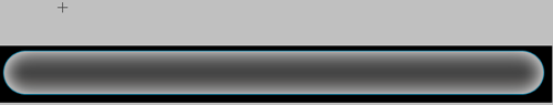
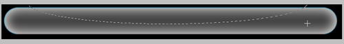
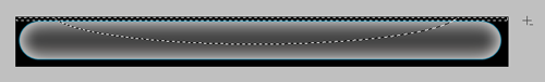
Select the rectangle tool (u) and drag out a rectangle on the canvas, it doesn’t matter at this point what color it is but do make sure the rectangle doesn’t fill the whole canvas. wpf002.png
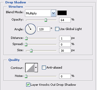
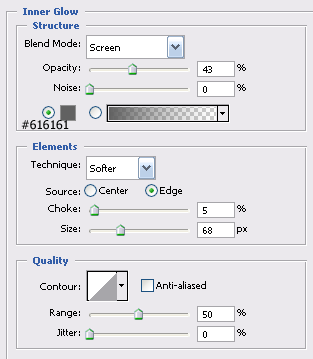
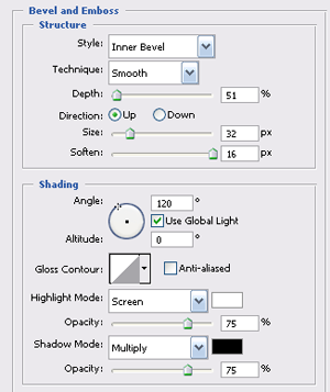
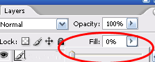
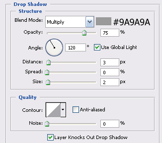
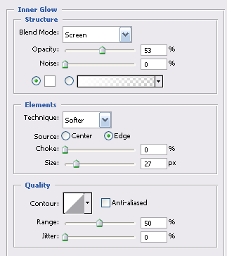
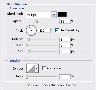
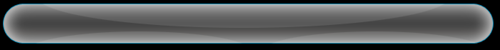
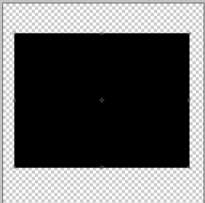
You need to convert this layer to a raster layer, and do this by right clicking on the layer and selecting ‘Rasterize Layer.’ Then right click on the layer and select ‘Blending Options’ after which you should select the following Shadow setting: distance= 10px, Spread= 0%, Size= 16px. Leave the rest as per the default settings. wpf003.png
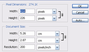
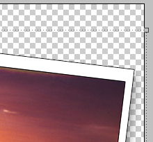
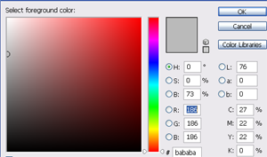
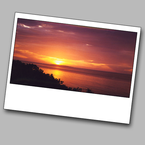
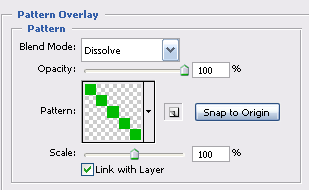
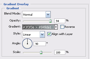
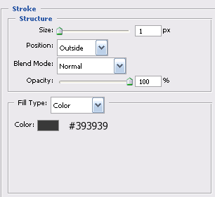
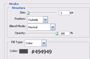
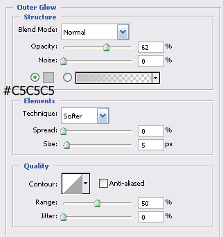
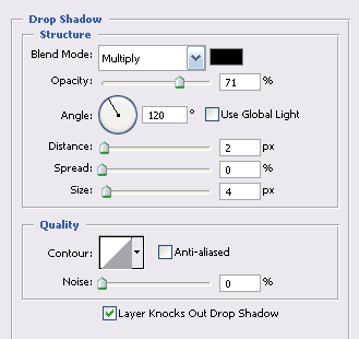
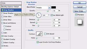
For the Color Overlay setting select #FFFFFF from the color picker and make sure it has 100% opacity, meanwhile the Stroke setting should be 1px wide on the outside, select #000000 from the color picker and then click OK. You should now have what looks like the back of an old photo on your canvas, so quite obviously you need to place a photo into it. Open your image and make sure it is the …

happygeek commented: another great tutorial, thanks +10
aakash.lpin commented: pretty nicely written post!! +0
virtuemart commented: cool tutorial +0
roryt 150 Nearly a Posting Virtuoso

no every image should be like this

img { 
padding: 0;
margin: 0;
border: 0;
}

You then need to set each images height and width. You also need to set the border, margin of all of your content to 0 if you don't want any. You may want to check your html to make sure there is no formatting in it.

(if you like the help why not give my rep a tickle ;) )

defeated commented: always willing to help and give great suggestion time after time. Thanks +1
roryt 150 Nearly a Posting Virtuoso

Sorry it's late mate, have a great day today and I hope you had a fantastic birthday. Thank you for all your hard work on this forum this year

happygeek commented: thanks for the support +10
roryt 150 Nearly a Posting Virtuoso

Although forms are one of the most boring elements of any website, styling them can be a dangerous business. All too often it is forgotten that the way a form looks will impact greatly upon what the user uses it for. Change the style too drastically and the user might not recognize it as a form at all. In this tutorial you will learn how to style the text field element just enough to make it look good but without ever detracting from the fact that it has to be easily recognizable as a text field from a form.

You will require the following software before you begin:Graphics editor
Text editor
You must create your graphic first, which needs to be a shadow on a white background. Importantly, the object that the shadow is coming from must not be visible. The image should be 1*25px with a white background.

You must also create a new HTML file, within which you need a form and then a text field. Your html should look like this:

<!DOCTYPE html PUBLIC "-//W3C//DTD XHTML 1.0 Transitional//EN" "http://www.w3.org/TR/xhtml1/DTD/xhtml1-transitional.dtd">
<html xmlns="http://www.w3.org/1999/xhtml">
<head>
<meta http-equiv="Content-Type" content="text/html; charset=iso-8859-1" />
<title>Styling a text field</title>
</head>
 
<body>
<fieldset><legend>Text Field Effects</legend>
 
<form action="" method="get">
<input name="Search" type="text" value="Search" maxlength="200" />
</form>
</fieldset>
 
</body>
</html>


You now have to add a class to this text field, which you could do using the "selector" "input" but …

happygeek commented: thanks for the tutorial +10
lakodajin commented: gr8 post +0
roryt 150 Nearly a Posting Virtuoso

In this tutorial you will learn how to create a stylish looking content box for your website. Before you start, however, you will need to have two custom patterns which should each be from a 5*5px image that just has a pencil line drawn diagonally across it. You need to create one of these with the pencil line color #000000 and one with #1b9a1b.

1) In Photoshop create a new document, sized 900*900px, and with a transparent background. You are creating a box that is so big so that you can use it for any piece of content simply by resizing it.

2) Fill the first layer in white for visibility purposes by using the Paint Bucket tool.

3) Now create a new layer and select the rounded rectangle tool. Set the radius to 60px, the color fill is not important for now. Your image should look like this:

iscb001.png

4) You need to add some layer styles to this, so right click on this layer within the layer pallet and select blending options, then add the following styles using the colors as typed on the images below: iscb002.pngiscb003.pngiscb004.pngiscb005.pngiscb006.pngiscb007.png

5) Now you have the basic look of the box itself and you could just leave it there. However, you are going to add more detail …

happygeek commented: thanks for the tutorial +10
roryt 150 Nearly a Posting Virtuoso

This tutorial will teach you how to create a transparent navigation bar for your website, similar to the navigation at the Microsoft Vista website .

1) Start by creating a new image in Photoshop with a height and width of 700*70px.

2) Filling the first layer with a dark background makes working on semitransparent layers much easier. After you have done this, create a new layer and grab the rounded rectangle tool. Set the radius to 60px and draw a rounded rectangle like this one:

tnip001.png

3) Go into this layer’s blending options (layer>layer style>blending options) and use the following settings: tnip002.pngtnip003.pngtnip004.pngtnip005.png

4) Click on OK and move to the layer pallet where you should set the fill of this layer to 0% and end up with something looking like this: tnip006.png

5) Now you have the main bar but you still need to give it a bit more of a transparent look. Create a new layer and grab the Elliptical Marquee tool. This is where you should put your cursor to start dragging out the marquee: tnip007.png

This is where you should have placed your cursor when you have finished the marquee: tnip008.png

6) You need to cut across this selection with another one so that when you fill it, …

happygeek commented: thanks for the tutorial +10
macgurl70 commented: thank you - very very helpful :D can't wait to use it +1
roryt 150 Nearly a Posting Virtuoso

This is illegal and it isn't gonna be easy anyway. Yahoo will have spent years improving their security. There is no easy way.

The only way that isn't really hacking or anything at all clever is just to answer their secret question, if you know the owner well this is often easy and it is actually normally quite easy just to slip the question into a conversation you are having with them...

It may be worth a try,

roryt 150 Nearly a Posting Virtuoso

My nice painting ARTWORK allied with many hackers

roryt 150 Nearly a Posting Virtuoso

How exactly are you looking for your mp3 player. It may display differently on your computer depending on your software. Have you looked to see whether it displays in the hardware manager?

roryt 150 Nearly a Posting Virtuoso

That must have taken ages. It is a great site and is packed full of tutorials, well done!!!

Mike555 commented: -mike555 +1
roryt 150 Nearly a Posting Virtuoso

http://www.daniweb.com/techtalkforums/post265577.htm - this guy here tries to do the same thing - I hope he tries my way and we can see the result :) . Otherwise I will have to do try it, but I don't have a lot of time. :)

I made this post and have tried your solution. Unfortunately although you set the height 100% it does not stretch the image to fit the browser windows height in IE and in Firefox it ust sets the image to 100% if it's normal size. And as Vishesh said this will not stop the background from staying static. This is not really a solution in my eyes. In the end I just made sure that my image displays the needed info on a 800*600 screen and a 1280*1024 screen. Oh well you better keep trying. BTW z-index is not a good idea for this because the only way you can set the contents position is by pixel or percentage which means you cannot center it.