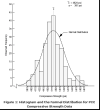
I have a series of data (x,y) as below. I want to use this data to
create a bell curve (normal distribution) with perl. How can I do
this?
x y
1 2
2 50
3 40
4 300
5 70
6 80
7 8
8 10
9 25
10 60
11 350
12 80
13 40
14 5

By normalized curve i mean something like on the link below. Didnt know how to draw a graph here.

Really appreciate any help clues.

http://training.ce.washington.edu/WSDOT/Modules/08_specifications_qa/normal_distribution.htm

Sorry, this question is way over my head. I got as far as plotting your data but it doesn't look like a bell curve... more like twin peaks. In case it helps as an example of a line graph, here's the script:

#!/usr/bin/perl
#bell_curve_line.pl
use strict;
use warnings;

use GD::Graph::lines;
my $perlscriptsdir = '/home/david/Programming/Perl';

#For some reason, installing GD::Graph didn't put save.pl in my @INC path
require "/usr/share/doc/libgd-graph-perl/examples/samples/save.pl";
my $chart_file_out = 'bell_line';
print STDERR "Processing $chart_file_out\n";

#The @data array is an array of array references
# to an array of x values and an array of y values.

my @data = (
[ qw(1 2 3 4 5 6 7 8 9 10 11 12 13 14 ) ],
[ qw(2 50 40 300 70 80 8 10 25 60 350 80 40 5 )],);

my $my_graph = new GD::Graph::lines();

$my_graph->set(
x_label => 'X',
y_label => 'Frequency?',
title => 'Frequency of Various Values of X',
y_max_value => 350,
y_min_value => 2,
y_tick_number => 10,
y_label_skip => 2,
box_axis => 0,
line_width => 3,

transparent => 0,
);

$my_graph->plot(\@data);
save_chart($my_graph, "$perlscriptsdir/data/$chart_file_out");

Running this creates a file called "bell_line.gif" (see attached).

commented: Active Supporter +2

I'm afraid it doesn't make much sense to me, maybe because I've forgotten the very little I learned about statistics over 35 years ago.

Here's what I don't understand: If you create a bar chart of actual data and draw a line through the centre of the top of each bar, I don't see how that makes two bell curves. Wouldn't you end up with just the line chart of actual data superimposed on a bar chart of the same actual data? I installed GD::Graph only after reading your question so I don't know much about it -- but I don't see any option for creating a curve. One approach might be to input the actual data points into some kind of algorithm that would create a long series of ordered pairs representing a best-fit curve, and then GD::Graph could plot that. But I don't know how to create such an algorithm. Hopefully someone else here on Daniweb acquainted with statistical analysis modules will reply to your question?

I notice that someone asked a question similar to yours at this link and the response to it sheds some light on the problem but doesn't contain the complete solution.

Hi David,
Thanks for your promt response.

but this a line curve of actual values.
Plot the data in a bars. Then create a curve over the bar chart. So that gives you 2 bell shaped curve. The curve will be through the center of each bar. Does it make sense?

See this link
http://training.ce.washington.edu/WSDOT/Modules/08_specifications_qa/normal_distribution.htm

Any help is greatly appreciated.

I looked at the example in the link you gave and the curve is not drawn through the centre of each bar. It looks like someone used their intuition to draw a bell curve that best fit the actual data represented by the bars. I doubt that GD::Graph can guess which bell curve best fits a small sample of data points. There may be statistical analysis packages that do this.

Be a part of the DaniWeb community

We're a friendly, industry-focused community of developers, IT pros, digital marketers, and technology enthusiasts meeting, networking, learning, and sharing knowledge.