my website layout breaks up when users zoom to +125% and to -65 in IE and ++2 and --2 in Firefox. Is there any way of fixing this?
Website was developed in PHP and uses CSS. I know I'm not the first person to face this but I can't find any similar questions/answers on here. Please let me know if you need anymore details.

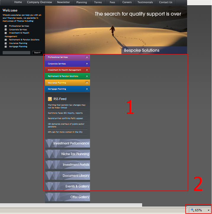
Dani AI

Generated

If the page falls apart only when users zoom, the most likely culprits are fixed pixel math and floated columns that rely on exact pixel totals. Zoom changes the browser’s pixel grid and causes sub‑pixel rounding; two columns plus margins/padding that exactly match the container can exceed it by a single pixel and force one column to drop. That explains why a simple float tweak or a fixed wrapper sometimes looks like it “should” work but fails at certain zoom levels.

Practical steps to fix and test (drop these in a copy of the stylesheet and test incrementally):

/* make box model easier to reason about */
*, *:before, *:after { box-sizing: border-box; }

/* contain floats without hiding visible drop-downs */
.container { /* avoid overflow:hidden here if items must expand outside */ }
.clearfix::after {
  content: "";
  display: table;
  clear: both;
}

/* images and media should be flexible */
img { max-width: 100%; height: auto; }

/* prefer percent columns rather than exact pixels */
.left { float: left; width: 28%; min-width: 160px; }
.main { float: left; width: 72%; }

Debugging checklist: confirm a valid DOCTYPE (standards mode), use the inspector to look at computed widths and the sum of widths+padding+margins, temporarily add outline/debug rules to see overflow, and reproduce the break by shrinking the container in devtools. If the left menu must expand, avoid giving the column overflow:hidden; instead make expanding submenus position: absolute so they don’t change the flow. For old IE-only fixes, zoom:1 can sometimes stabilize float quirks (nonstandard).

’s float/fixed-width suggestions are a reasonable start, but since those didn’t help for , try the box-sizing + percent-width approach and isolate the expanding menu so its growth won’t push the layout out of alignment.

Recommended Answers

All 6 Replies

Can you post a link to the site?

You could try adding float:right to the class 'block3_padding'

had already tried that...no joy. so it was taken out again...unless it needs to be used in conjunction with something else

Have you tried putting both columns in a div with a fixed width?

tried that with the column control css but had problems when expanding the coloured menus on the left to show the different services under each area

Be a part of the DaniWeb community

We're a friendly, industry-focused community of developers, IT pros, digital marketers, and technology enthusiasts meeting, networking, learning, and sharing knowledge.