I have been developing window form applications for probably the last 4 or 5 years, and have drasticially improved my UI designing, which I am rather proud of, as it's a art form you might say. A whole thing of its own on top of development.

But while I have admitted I have gotten better, I feel I can still improve. Also, I am starting this topic for others to learn off of as well. An exchange of information you might say.

So let's hear it, what tips have you learned over time? (I will share mine a little later)

do you mind if I ask you what UI environment you are using, eg Winforms or WPF? Or are you asking specifically about layout, navigation etc?

what tips have you learned over time?

The technical stuff is easy. My biggest wins in UI design have come from end user feedback. Things I find to be obvious are often obtuse to an end user, and knowing what confuses them has helped me to build intuitive interfaces.

On the technical side, one thing I'm careful about with WinForms is control updates. Especially with a NumericUpDown control, I've found that keyboard entry tends not to get applied after focus is lost unless you're careful about binding.

Let's see...how about finishing off with an extension method I use for WinForms that's a convenience when setting/resetting a control's binding?

/// <summary>
/// Convenience method for resetting data bindings.
/// </summary>
/// <remarks>Clears and re-adds the binding.</remarks>
public static void ResetBinding(this Control ctrl, string propertyName, object dataSource, string dataMember)
{
    ctrl.DataBindings.Clear();

    if (dataSource != null)
    {
        ctrl.DataBindings.Add(propertyName, dataSource, dataMember, true, DataSourceUpdateMode.OnPropertyChanged);
    }
}

Simple, yes, but makes for cleaner code in the majority of bindings:

/// <summary>
/// Binds configuration elements to the editor.
/// </summary>
private void BindUI()
{
    textBoxName.ResetBinding("Text", Value, "Name");
    textBoxServer.ResetBinding("Text", Value, "Server");
    textBoxDatabase.ResetBinding("Text", Value, "DatabaseName");
    textBoxLogin.ResetBinding("Text", Value.Credentials, "Login");
    textBoxPassword.ResetBinding("Text", Value.Credentials, "Password");
}
  1. Continuously utilize adorable symbols, catches, and design. Everybody cherishes huge red hearts, pink bunnies, and yellow smily confronts.

  2. Don't be reluctant to try different things with colors!

  3. Your application ought to play fun sounds while working to keep the clients entertained.

  4. Never, ever, under any condition utilize the OS-local graphical controls or gadgets. Clients get exhausted of the same old catches, content boxes, and stuff.

  5. At the point when conceivable, impair window administration and use surprising, strangely put illustrations for the windowing capacities, for example, the window close alternative.

  6. At the point when composing your own particular controls or gadgets, verify they look and feel not at all like the OS-local gadgets or all else the client may anticipate. Else you may coincidentally make the client surmise that your application is really intended for their OS.

  7. Utilize your inventive plans on how a "recovery as" dialog ought to look and work. Inherent ones are dependably excessively constraining.

  8. It is paramount that the client ought to never have the capacity to differentiate between a checked and unchecked check box or choice box.

commented: Good yoke! +15

You joke, Richard, but it's not quite so clean cut. ;) For example:

Don't be reluctant to try different things with colors!

I got laughed at by coworkers for using pastels instead of primaries (the usual red, green, blue), but the users agreed pastels were easier on the eyes and no less informative.

do you mind if I ask you what UI environment you are using, eg Winforms or WPF? Or are you asking specifically about layout, navigation etc?
Take your pick. I am just wanting ot hear what others have to suggest. Things you have come to learn that you want to share with others.

RichardGalaviz, hahahah, the example of what NOT to do.

I got laughed at by coworkers for using pastels instead of primaries (the usual red, green, blue), but the users agreed pastels were easier on the eyes and no less informative.
I am now just starting to getting away from the default colors assigned. It's rather tricky. So much to choose, but don't want to irittate the user

So here's some useful stuff I have learned, especially when it comes to resizing (which is awesome to support).

Okay as for mine, one that I have become fond of is anchors.This property can be applied to any component (that I know of), and what it does is set a, well, 'anchor' on the windows form. So say you set a right anchor, anytime the right side of the form moves, so does the right side of that component.

These are very useful, and once you get the hang of them, can really learn the benefits (took some practice to fully utalize them). And don't forget their is padding and margins to help shift the item over x amount.

Another great one to use, with anchors especially, is a TableLayoutPanel. These work great with anchors and within themselves. Allowing you to keep your layouts clean and semetrical. If you haven't seen them, they grid pretty much you can drop components into.

You can then, for instance, anchor them to the TableLayoutPanel, and maybe set it up so that cell you placed it in, has a fixed size, or a percent of the grid to hold. Hard to fully explain, it's a lot easier just to try them out

And to top it off the Maximum Size and Minimum Size properties for a Windows Form. Ever want the default FormBorderStyle at sizable, but want to limit the sizing. Maybe you want to limit how small they can make it, without having them start shoving items off the screen. Or you like the sizable option but want to treat it as a fixed dialog. These allow for that. Just remember if you resize your form in the code, make sure you update these values respectively

If you're designing a game or something like that you can let all your beasts loose regarding design. It does not matter that much. It is something totaly different if you want to produce a "business sort of application".
Design is indeed an art on it's own.
@Ange1ofD4rkness: had similar problems with resizing and even TableLayoutPanel.
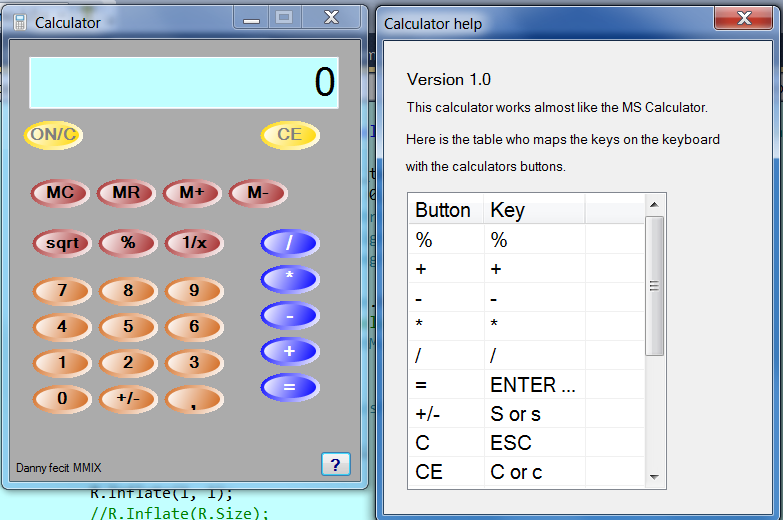
See here,were you can notice the buttons are not aligned because of a different monitor:
b0d7d0ae4e921cbc9e914f35ece19b50
Also notice the design trick of the buttons(did not invent this, saw it somewere): I drew an ellipse with gradient color and on top, a smaller ellipse with the same but reversed gradient color. Instant 3D effect!
Here is some code (with all my doodling it also) In fact I do not plan to work on it any more. If I can find the time I rework this to WPF
The calculator works, and I finally found out that 2 + 2 is 4.

private void DoDraw(Graphics G, bool sw) //sw does the color swap, quicker than a swap routine!
        {
            Brush textBr = new SolidBrush(_textcolor);
            Rectangle R = new Rectangle(0, 0, this.Width, this.Height);
            StringFormat strFormat = new StringFormat();
            strFormat.Alignment = StringAlignment.Center;
            strFormat.LineAlignment = StringAlignment.Center;

            G.SmoothingMode = SmoothingMode.HighQuality;    // change??????
            //G.InterpolationMode = InterpolationMode.NearestNeighbor;
            G.PixelOffsetMode = PixelOffsetMode.HighQuality;// change?????? 
            //Rectangle R2 = R;
            //R2.Inflate(-2, -2);
            GraphicsPath path = new GraphicsPath();
            path.AddEllipse(R);
            this.Region = new Region(path);

            R.Inflate(1, 1);
            //R.Inflate(R.Size);
            LinearGradientBrush linBr;
            if (sw)
                linBr = new LinearGradientBrush
                    (new Point(R.Left, R.Top), new Point(R.Right, R.Bottom), _endcolor, _startcolor);
            else
                linBr = new LinearGradientBrush
                   (new Point(R.Left, R.Top), new Point(R.Right, R.Bottom), _startcolor, _endcolor);
            //////////////
            //R.Inflate(-1, -1); 
            //Pen pen = new Pen(_startcolor); 
            //pen.Width = 1f; 
            //G.DrawEllipse(pen, R);
            //R.Inflate(1, 1);
            G.FillEllipse(linBr, R);

            R.Inflate(-5, -5);
            LinearGradientBrush linBrBack;
            if (sw)
                linBrBack = new LinearGradientBrush
                    (new Point(R.Left, R.Top), new Point(R.Right, R.Bottom), _startcolor, _endcolor);
            else
                 linBrBack = new LinearGradientBrush
                    (new Point(R.Left, R.Top), new Point(R.Right, R.Bottom), _endcolor, _startcolor);
            G.FillEllipse(linBrBack, R);

            G.DrawString(this.Text, this.Font, textBr, R, strFormat);
        }

        protected override void OnPaint(PaintEventArgs pevent)
        {
            //base.OnPaint(pevent);
            DoDraw(pevent.Graphics, _swap);    
        }
Be a part of the DaniWeb community

We're a friendly, industry-focused community of developers, IT pros, digital marketers, and technology enthusiasts meeting, networking, learning, and sharing knowledge.